What is colour? In simple terms, colour is broken white light. How each colour is perceived depends on the dissection of light at different wavelengths and how objects absorb or reflect them. That is how we explain colour in scientific terms, but what does it mean for design?
Colour is something we feel, and has the power to affect our mood. For this reason, it is no surprise that colour plays an essential role in kitchen design and creating the right atmosphere for entertaining, dining and relaxing. Paint is one of the easiest (and inexpensive) ways to make a huge impact.
Colour is a bit like fashion, constantly shifting in response to trends and seasonality. Below are the headlines so far for 2018:
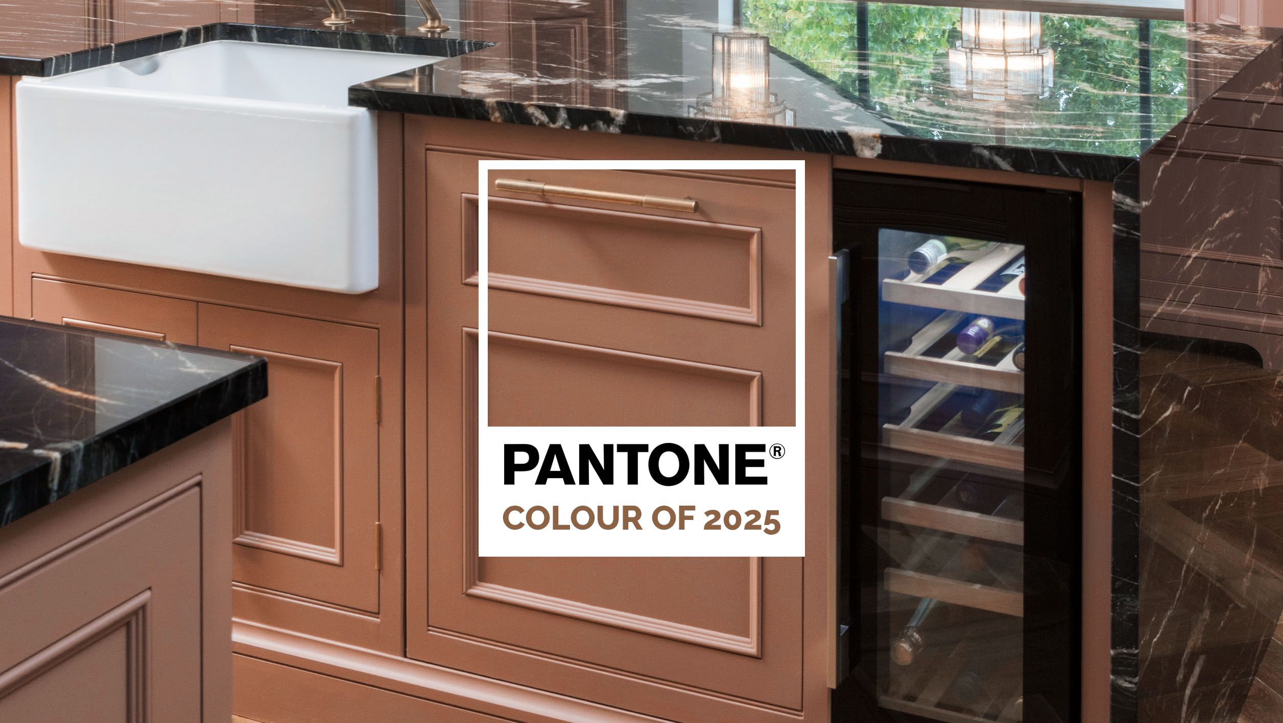
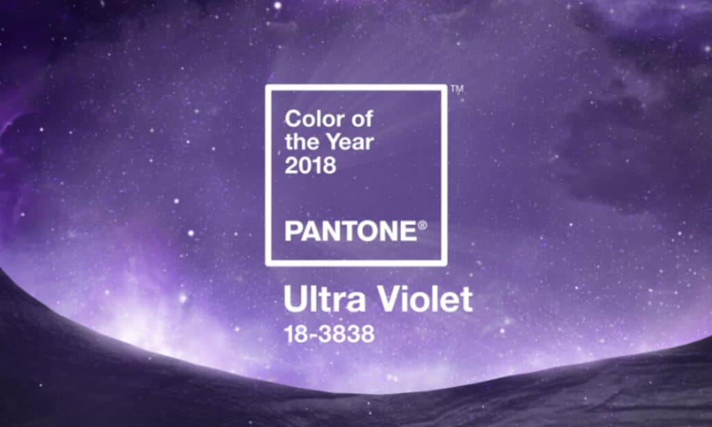
PANTONE COLOUR OF THE YEAR
Pantone has become a national clarion call for colour. As Laurie Pressman, VP of the Pantone Colour Institute, said “it has come to mean so much more than ‘what’s trending’ in the world of design, it’s truly a reflection of what’s needed in our world today”.
Well, according to Pantone, 2018 calls for purple – Ultra Violet to be exact. To explain, we are told “Ultra Violet suggests the mysteries of the cosmos, the intrigue of what lies ahead, and the discoveries beyond where we are now. The vast and limitless night sky is symbolic of what is possible and continues to inspire the desire to pursue a world beyond our own”. Despite its authority, there are inevitably mixed reviews with each announcement.
Like it or loathe it, the Pantone Colour of the Year is one of the most established colour institutions, so you can expect to see more purple in the future.
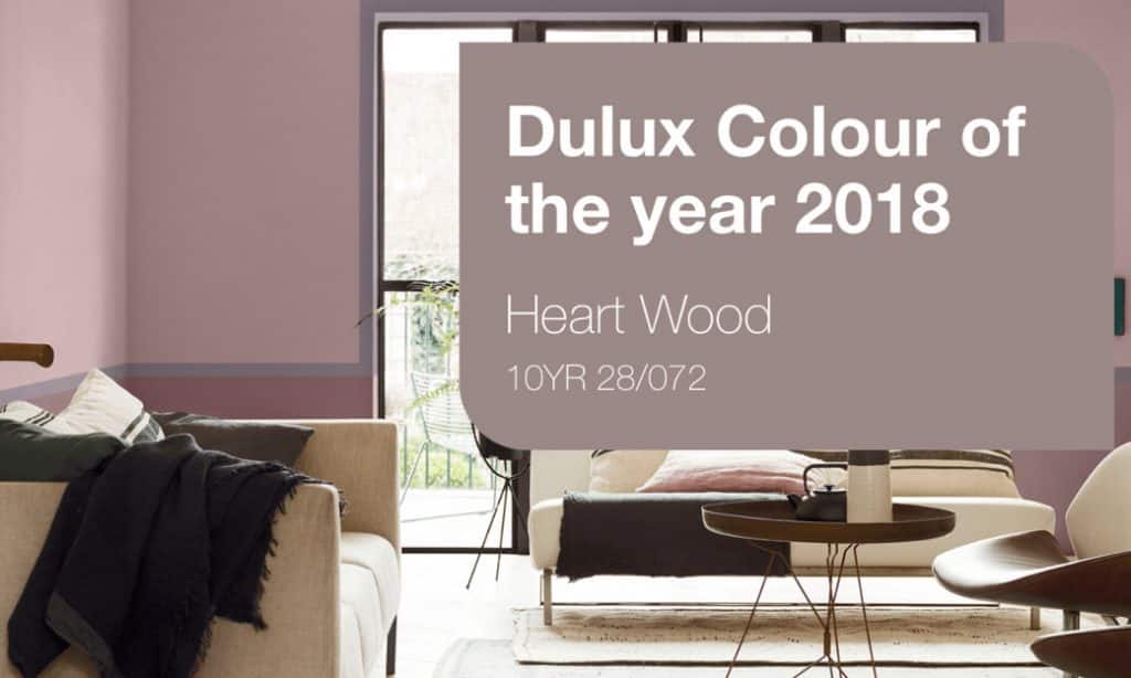
DULUX COLOUR OF THE YEAR
Heart Wood is the shade of 2018, according to Dulux. A mix of smoky taupe and dusky mauve, it is described as a ‘warm neutral, with a hint of heather’ and seeks to provide sanctuary for homeowners. Dulux explain: “The warmth of wood reflects the comfort that we need in these uncertain times”.
CROWN PAINTS COLOUR INFLUENCES
Comparatively, Crown Paints presents three colour trends for Spring/Summer 2018 as part of its annual Colour Influences launch. Provocative, is described as “a bold reaction in colour form”, while Linear is about working with the simplicity of lines; “imagine the low light of dusk casting long shadows and you capture the spirit of Linear”. Finally, the third trend, Bloom, is “the romantic token of nature at its most magnificent, with fresh floral tones on a long spectrum from lively greens to deep-seated pinks and purples”.
There are countless trends. However, similar to fashion, trends will come and go but there are certain dogmas that transcend time.
Colour psychology is the study of how colour makes us feel; this is a good place to start when selecting colours as part of your design. It is important to consider how you want to feel in your kitchen, instead of simply considering how it will look.
COLOUR SPECTRUM
Below we have looked at a spectrum of colours and highlighted their respective merits:
- If you want to create a bold space: Red
Red is the colour of passion and helps to get blood pumping, literally. It is proven to enhance metabolism, increase respiration rate and raise blood pressure. A symbol of strength, love and danger, it has a long spectrum of psychological associations ranging from war and power to passion, desire and, of course, love.
- If you want to create a joyful space: Yellow
Yellow is a joyful colour and seen as a symbol of energy, happiness and intellect. In addition to its uplifting affects, it also stimulates mental activity and generates muscle energy. Bright, pure yellow is also a great way to grab attention and stand out – in fact, this is why many road/warning signs are painted in yellow. If overused it can have a disarming effect, so apply carefully.
- If you want to create an energising space: Orange
Orange is a colour of stimulation and enthusiasm. Associated with sunshine and the tropics, it combines red’s passion and yellow’s joy. Research has found that orange increases oxygen supply to the brain to stimulate activity and energy levels.
- If you want to create a peaceful space: Green
Green is the colour of nature, symbolising growth and freshness. The colour has great healing powers and is also commonly associated with safety and stability. On top of that, it is also considered a restful colour for our eyes, helping to create harmony.
- If you want to create a calm space: Blue
Blue is considered the most stable colour. Often associated with depth and stability, it is proven to slow human metabolism and produce an overall calming effect. This helps to instill tranquility.
- If you want to create an opulent space: Purple
Combining the stability of blue and the energy of red, purple is also the colour of royalty. It symbolises power, nobility and luxury. It also has strong associations with wisdom, dignity, mystery and magic.
- If you want to create an elegant space: White
White remains the best-selling paint colour. It has a strong association with light, goodness and purity and, for this reason, is considered the colour of perfection. It is very versatile and will bring positive connotations in any space.
- If you want to create a dramatic space: Black
A mysterious colour linked with the fear of the unknown, black has many associations ranging from power and elegance to mystery and evil. Although it can sometimes suffer from negative connotations (consider “blacklist”), it also denotes strength and can create an elegant space.
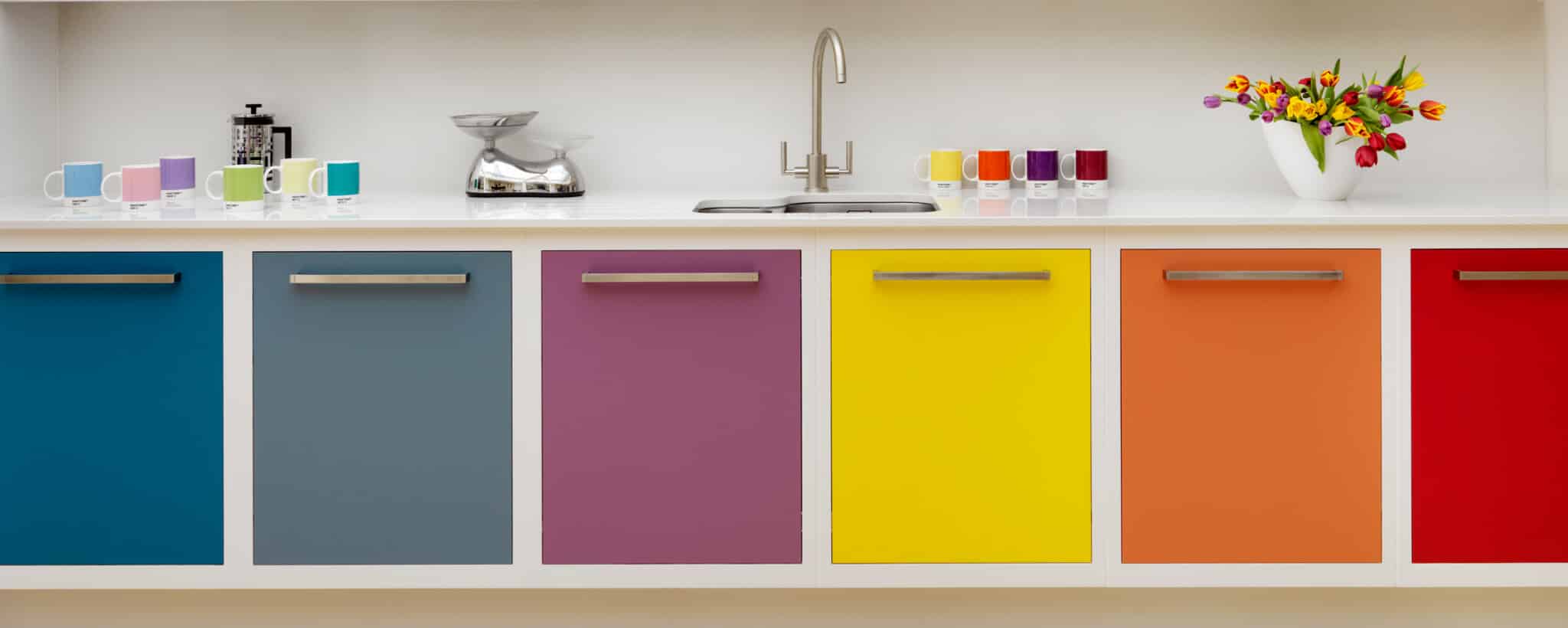
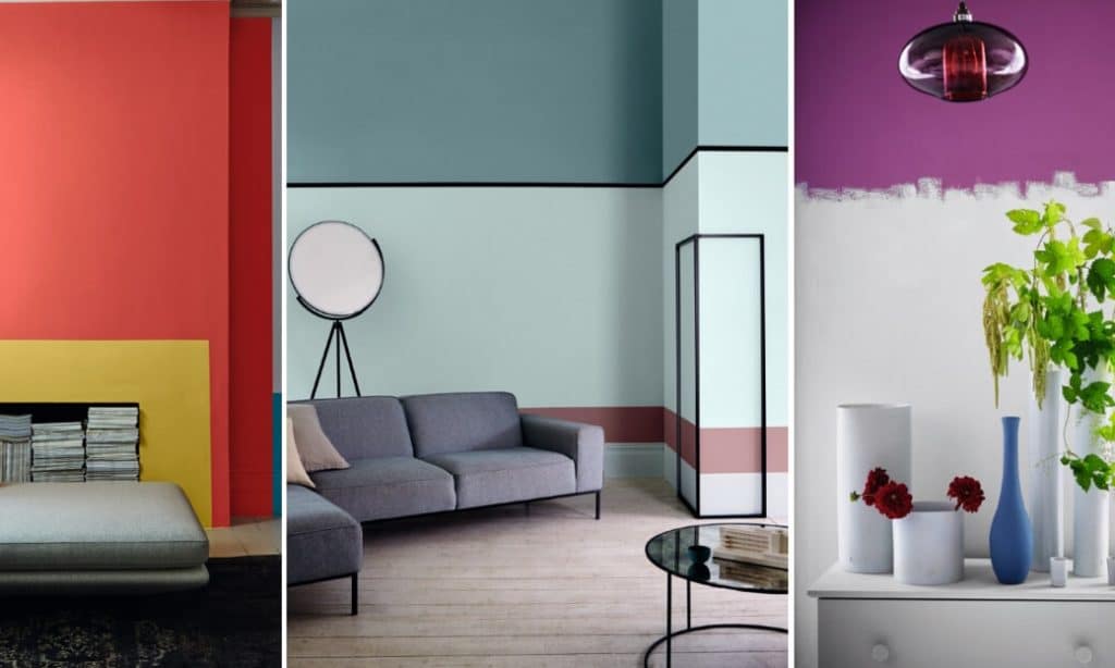
Once you have decided on the core colour for your kitchen, you can start to experiment with pairing and contrasting. There is an art form when it comes to choosing complementary colours; the process is complex but simplified into six different schemes, all of which are explained below:
A COMPLEMENTARY COMBINATION
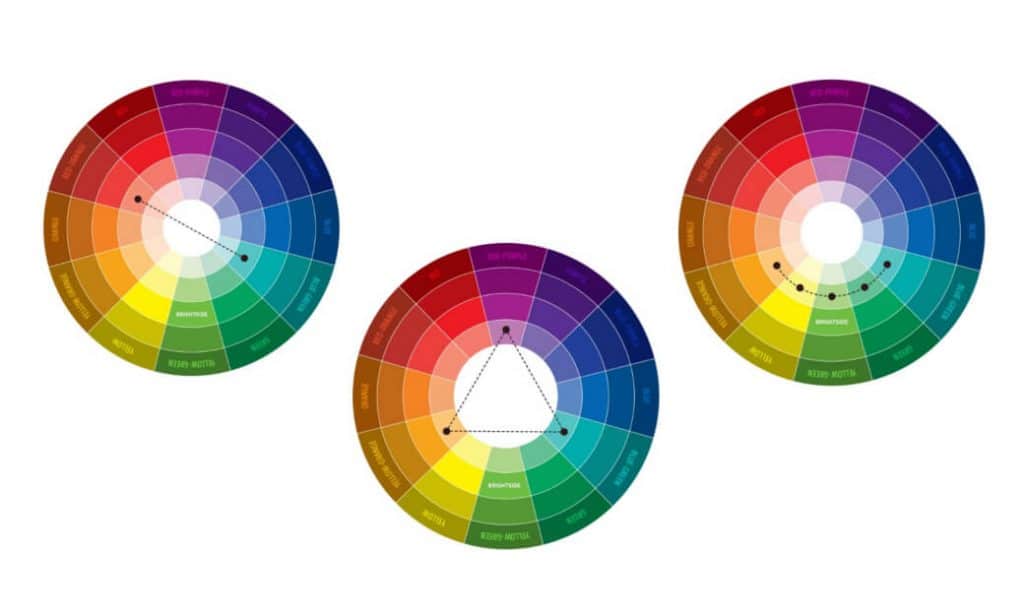
Complementary
Also known as supplementary or contrasting; colours sit opposite one another on the Itten colour circle. This is a good scheme for creating a vivid and energising space.
The triad
Three colours, all equidistant from each other on the colour circle. It produces a high contrast effect while preserving ‘harmony’. Great with pale and unsaturated colours.
An analogous combination
This is a combination of two to five (ideally two or three) colours that are adjacent to each other. It creates a calming impression and works effectively with greens and yellows.
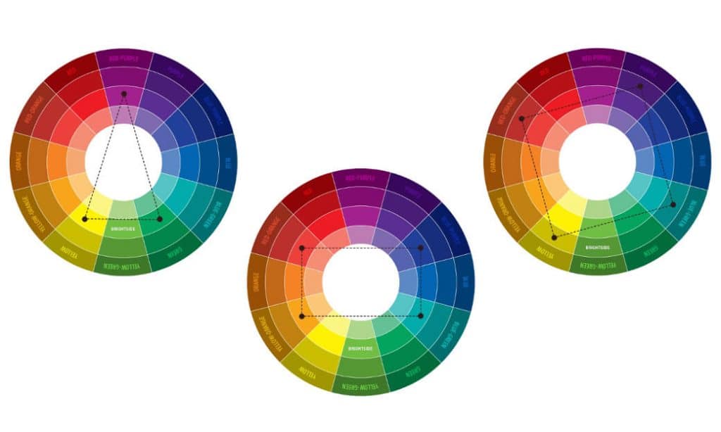
The split complementary combination
A variation on the complementary colour combination where you combine one primary and two complementary colours. The overall effect is harmonious and less intense than the analogous combination.
The tetrad
This is a scheme that includes one primary and two complementary colours, plus an additional colour for accents.
The square
A combination of four colours that are equidistant on the colour circle. When using this scheme, the colours differ from each other in tone, but are also complementary. Ideal if you’re hoping to create a dynamic kitchen.
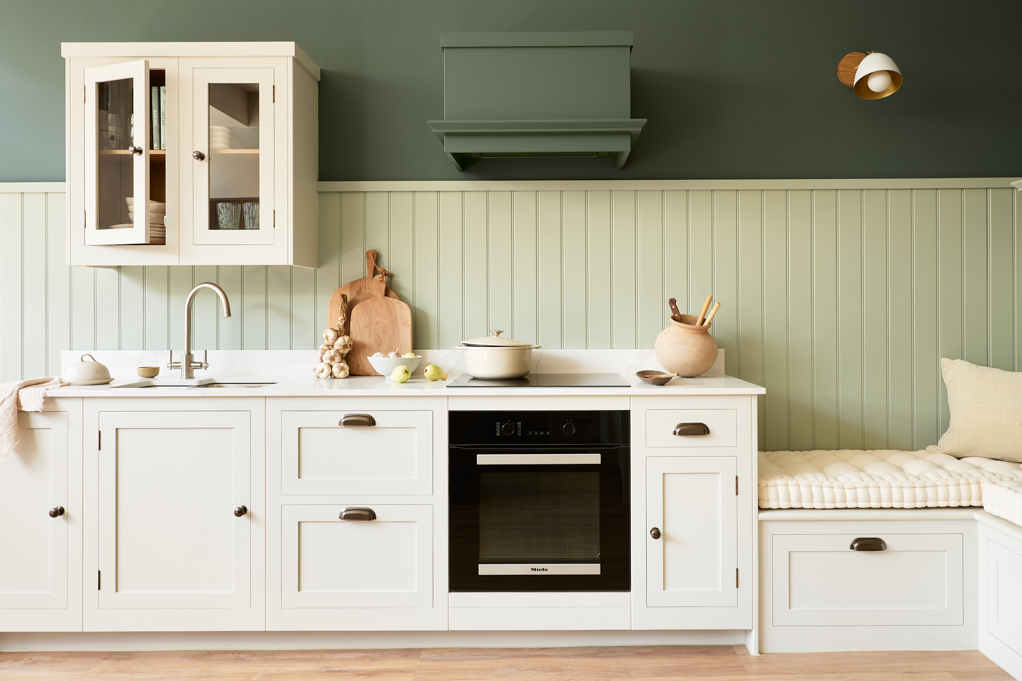
Whatever scheme you select for your kitchen design, you can exploit the true impact of colour by incorporating it to your walls, cupboards and central island. All our kitchens are hand painted in any colour you desire, giving you the freedom to experiment and re-style it in years to come.
Ready to start designing? Visit your local Harvey Jones showroom to speak to one of our expert designers about using colour in your kitchen. Alternatively, request a copy of our brochure for more colour inspiration here.