Move over blue and grey, there are several new players in town and they’re poised, ready to take your kitchen cabinetry crowns!
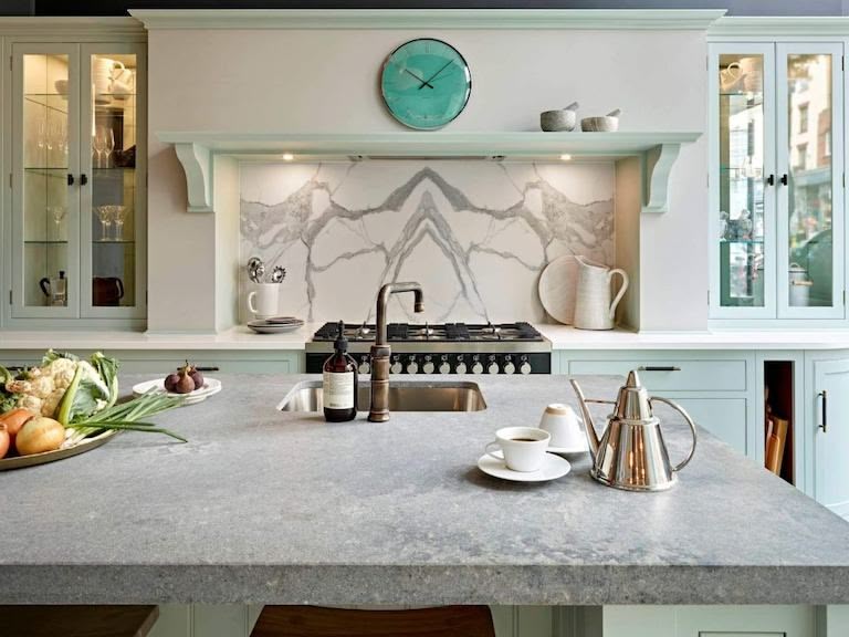
The replacing of traditional yellow incandescent bulbs with cooler LED lighting meant that previously cold colours such as grey looked far less bleak and battleship-like in our less-than-sunny homes and soon grey was the latest neutral to take over interiors. In kitchens, grey and dark blues, also aided by better lighting, have come to signal sophistication in a scheme. While we admit that they probably still have some time to run, it’s encouraging that social media in particular is showing the love for more adventurous shades.
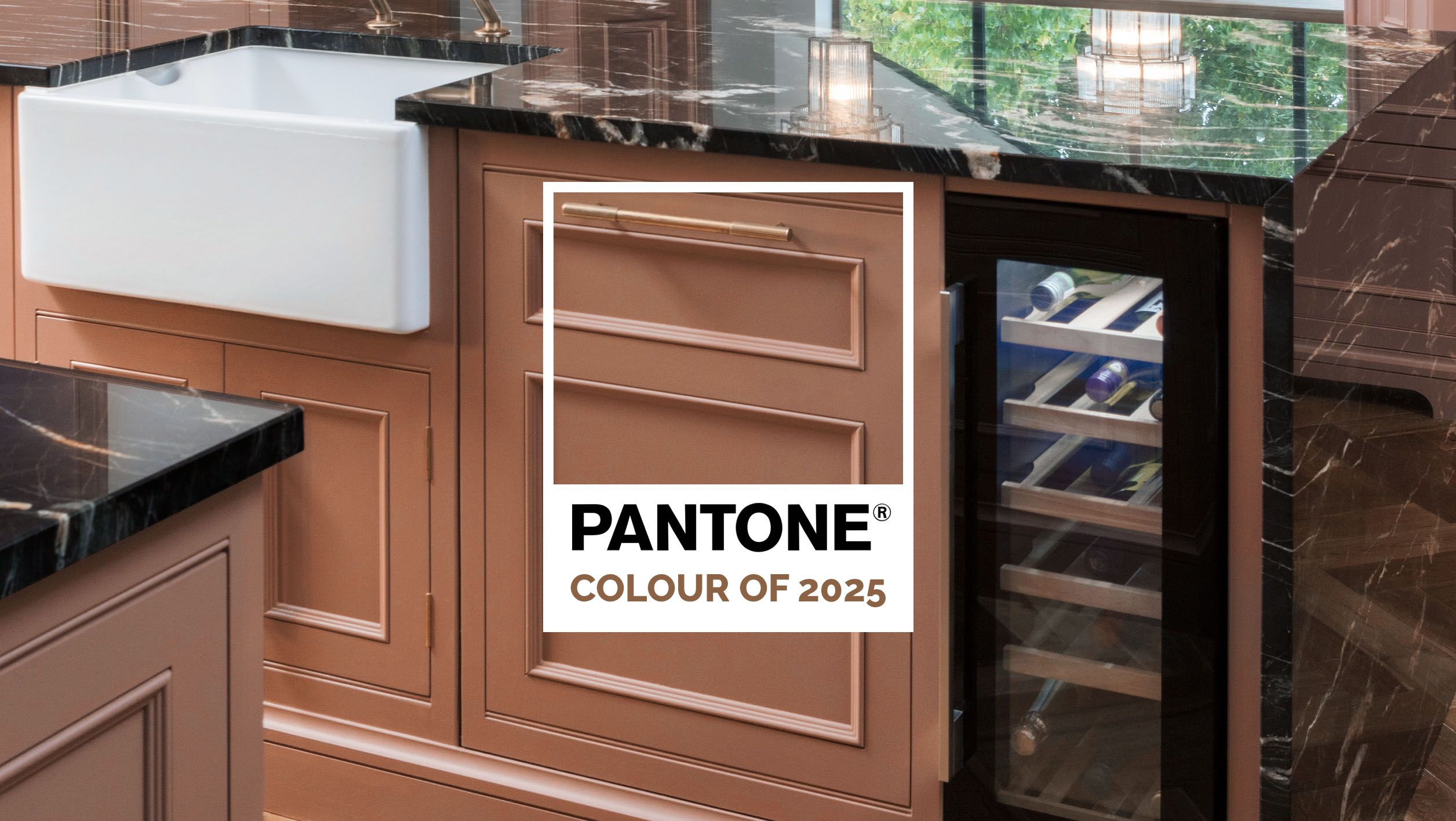
A few seasons ago colours started showing up in collections that hadn’t been evident in home design since the 70s and 80s. Desert schemes with rich tones of ochre and terracotta began to surface on soft furnishings, predominantly cushions, rugs and throws, and lush velvets in jewel tones jazzed up sofas and boudoir chairs, as well as table lighting and curtains. Finally, pink began a real renaissance. No longer the preserve of little girls’ bedrooms its transformation from candy bubble gum to subtle rose and blush are fast turning it into the new neutral.
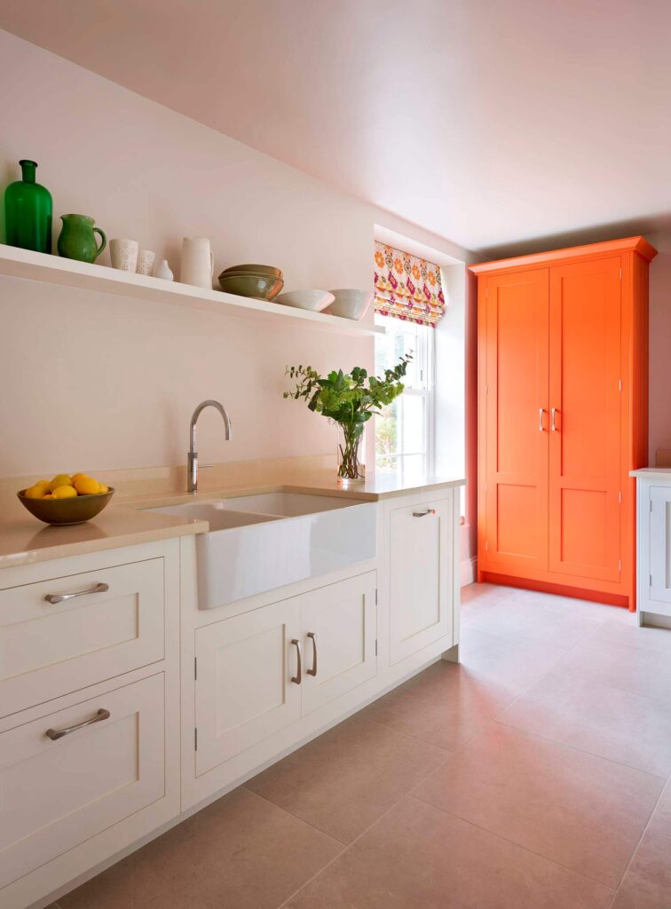
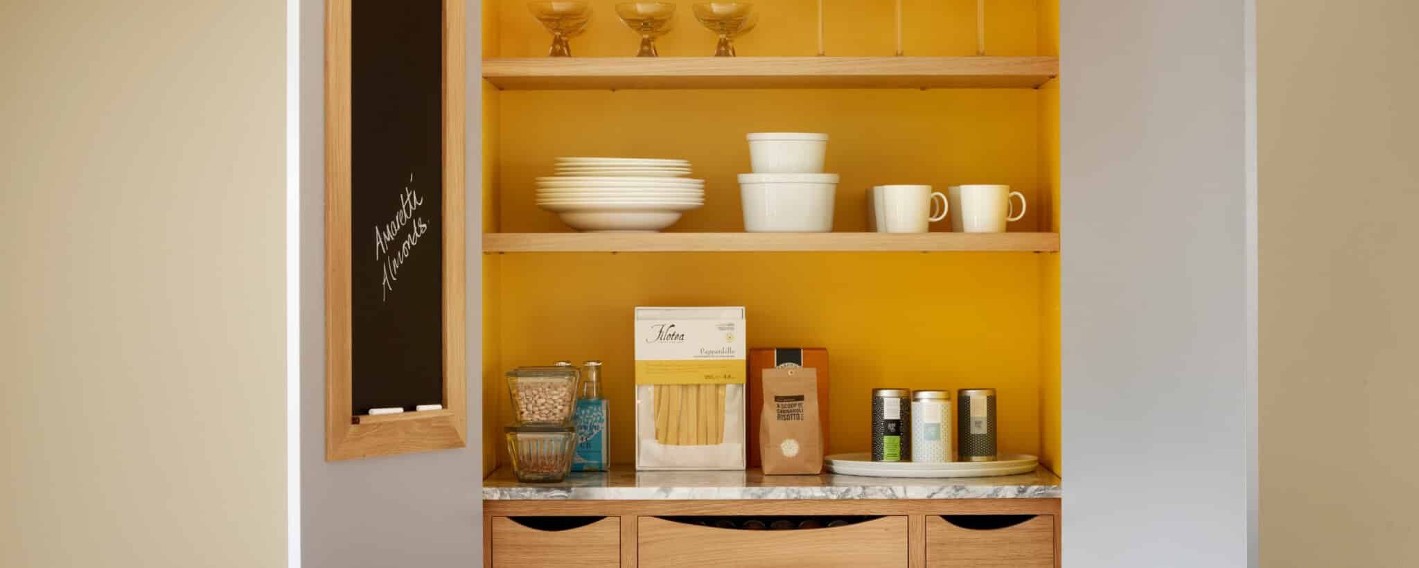
Once we’d accepted these new hues for our accessories, it was a simple hop, skip and jump to considering their use on bigger pieces of furniture. First it was accent larders in racing green or fresh mint, or encaustic tiles featuring Aztec motifs for splashbacks and walls painted in dusky shades or rose. Now, it seems, we’re ready to go the full nine yards, using various shades of green, ochre and pink on our cabinets and walls, too.
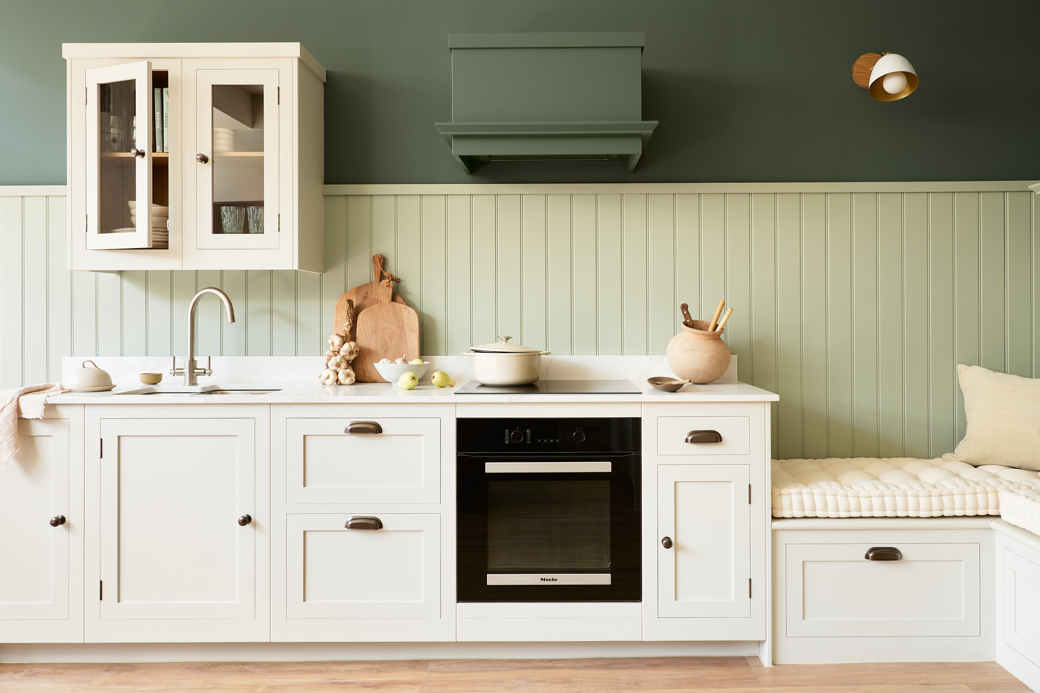
While sofas might rock the jewel tones, softer greens are great if you’re covering a large area. For cabinetry opt for Bancha from Farrow & Ball, a chalky olive that was one of its nine new colours released last year. Whether you prefer olive or emerald or something more minty fresh, green is definitely having a comeback moment. If you don’t want to splash it all over the cabinets, then why not invest in a cast iron range from Aga in Pistachio Green?
Rose gold is popping up more frequently in taps and it’s a shade that’s getting a fair bit of attention in lighting, too, not just on the shades themselves but in the metallic hues of the fittings as well. Another popular colour from Farrow & Ball, Setting Plaster, has been an Instagram favourite for a while now but you could also try Fired Earth’s Manna Ash, which is a subtle blush.
