It’s on cold and wet days like the ones we’re currently experiencing that we’d all benefit from a little colour to lift our mood. And where better to start than the kitchen?
While it’s true that the most popular designs still tend to be white or cream, a hand-painted, bespoke design has the advantage of giving you a limitless palette of colours, from subtle off whites to moody graphites and everything in between.
EMBRACE THE NEW NEUTRALS
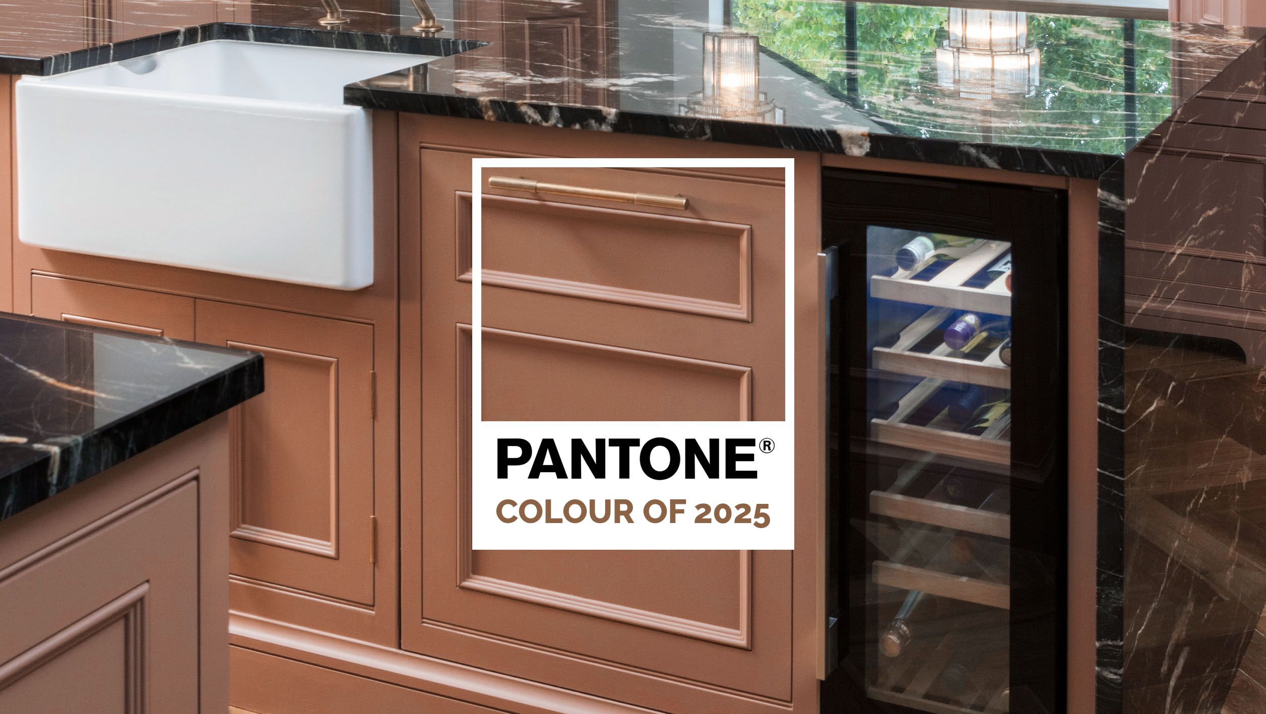
So, where to start? Well, if you’re not planning to plump for a bold plum or rich red then the ‘new neutrals’ are a good place to start.
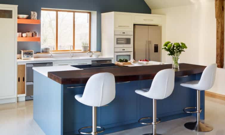
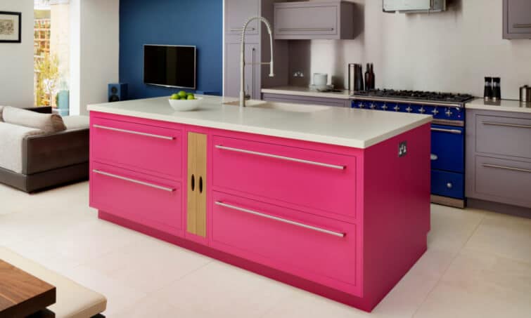
Shades of soft greys, warm stone and pale blues are good choices. They’re great on their own but they also work conjunction with a bold hit of colour, neon pink, for an island for instance, or dark graphite grey on a bank of cabinetry.
Easier to live with and less likely to feel dated than some colours, these subtle shades work well with most worksurfaces and flooring making them easier to update if your tastes change. Neutral colours are particularly susceptible to change at different times throughout the day – looking quite different in natural and artificial light. Use this to your advantage by opting for shades that will appear fresh by day and welcoming by night. It’s always a good idea to test colours to see how they feel both in the evening and the morning in various parts of your room.
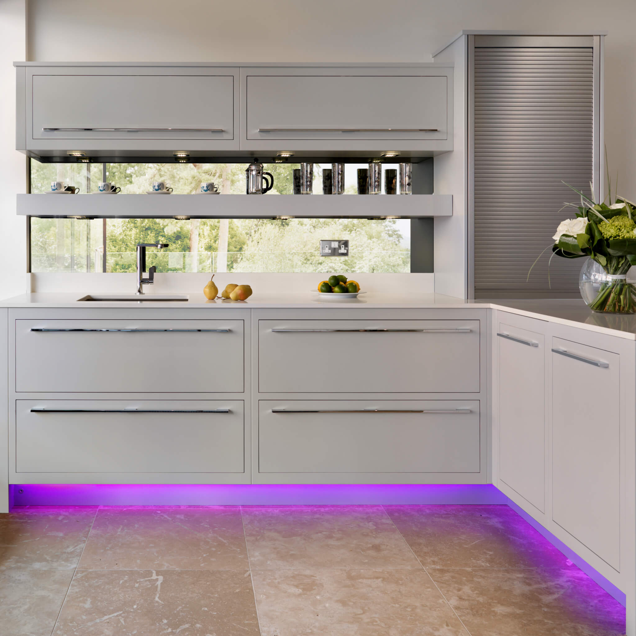
If your kitchen is north facing avoid colours on the cool spectrum as the light will tend to make it feel cold. Lighter shades work well if there’s little or no natural light and remember to install lots of task and mood lighting.
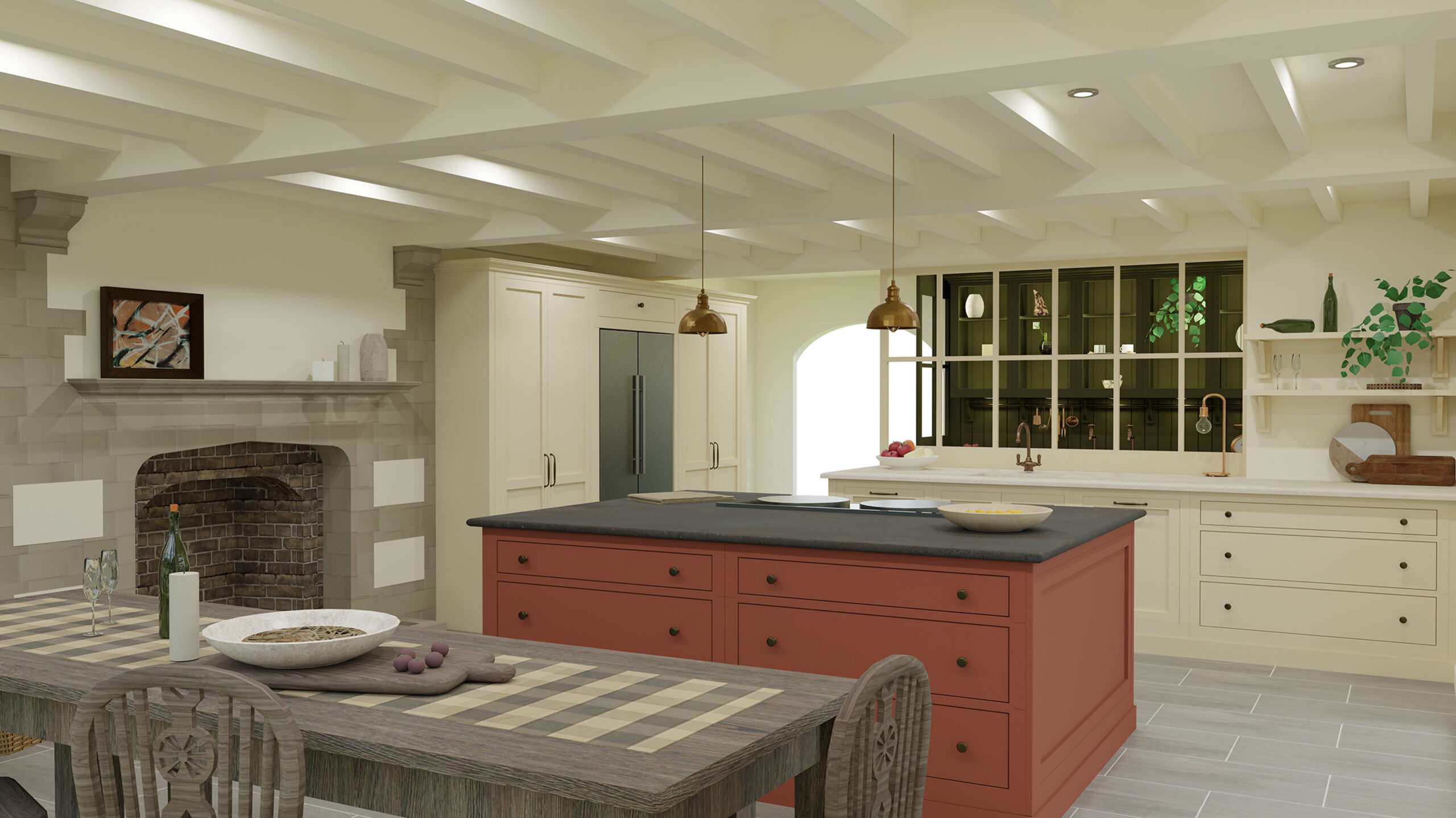
A LITTLE GOES A LONG WAY
Adding colour isn’t for the faint-hearted but if you don’t feel the need to play it safe, the right shade will add real pizazz to a scheme. While most of us probably won’t opt for a bold green or bright pink over the whole kitchen, adding accents with the use of selected pieces of furniture, surfaces and accessories can be a great way to be a little more adventurous. Stronger shades such as deep blues, dark greys and warm reds are increasingly popular right now. The secret of using colour well is to use it carefully. While trends help to inspire, it’s best not to follow them too slavishly, although the beauty of a hand-painted kitchen is that you can have it repainted if you tire of the colour in two or three years’ time.
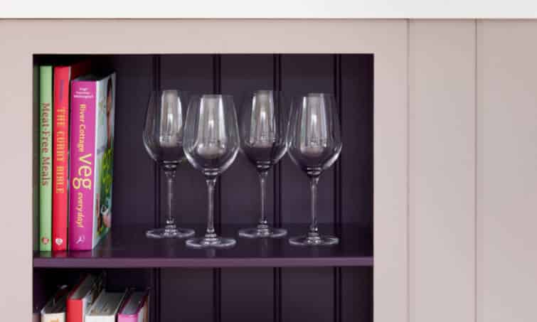
If you’re a little unsure about your chosen shade and concerned that it might feel a little overbearing, use it sparingly and below your direct sight line as you go into the kitchen as that will make it easier to live with. Remember, colours will affect the mood of a room, too. In general, warm colours that ‘advance’, reds and yellows for instance tend to be energising and stimulating, while cooler ‘receding’ shades such as blues and greens will feel calming and soothing.
Our brochure is full of kitchens we’ve designed for clients and features a wide range of colours. Request your complimentary copy here.