It would be a mistake to think of a kitchen merely in terms of appliances and layout. Of course, the equipment is important to creating a practical space, however, the visual elements are also essential in getting your kitchen to work for you. The impact of the right colour scheme cannot be overstated — it can make your kitchen appear larger, create an inviting atmosphere that will encourage you to cook and host others more, and add flair to your home.
But how do you know which colour scheme is the best for your kitchen? And what are some things you should pay attention to when creating a colour palette in the first place? Here at Harvey Jones, we’ve been building kitchens for more than 40 years, putting together functional and beautiful rooms utilising a variety of hues and styles. So, we’ve let our experts come up with a few tips for the best kitchen colour scheme for your needs.
Elements to consider when choosing a kitchen colour scheme
The shape and size
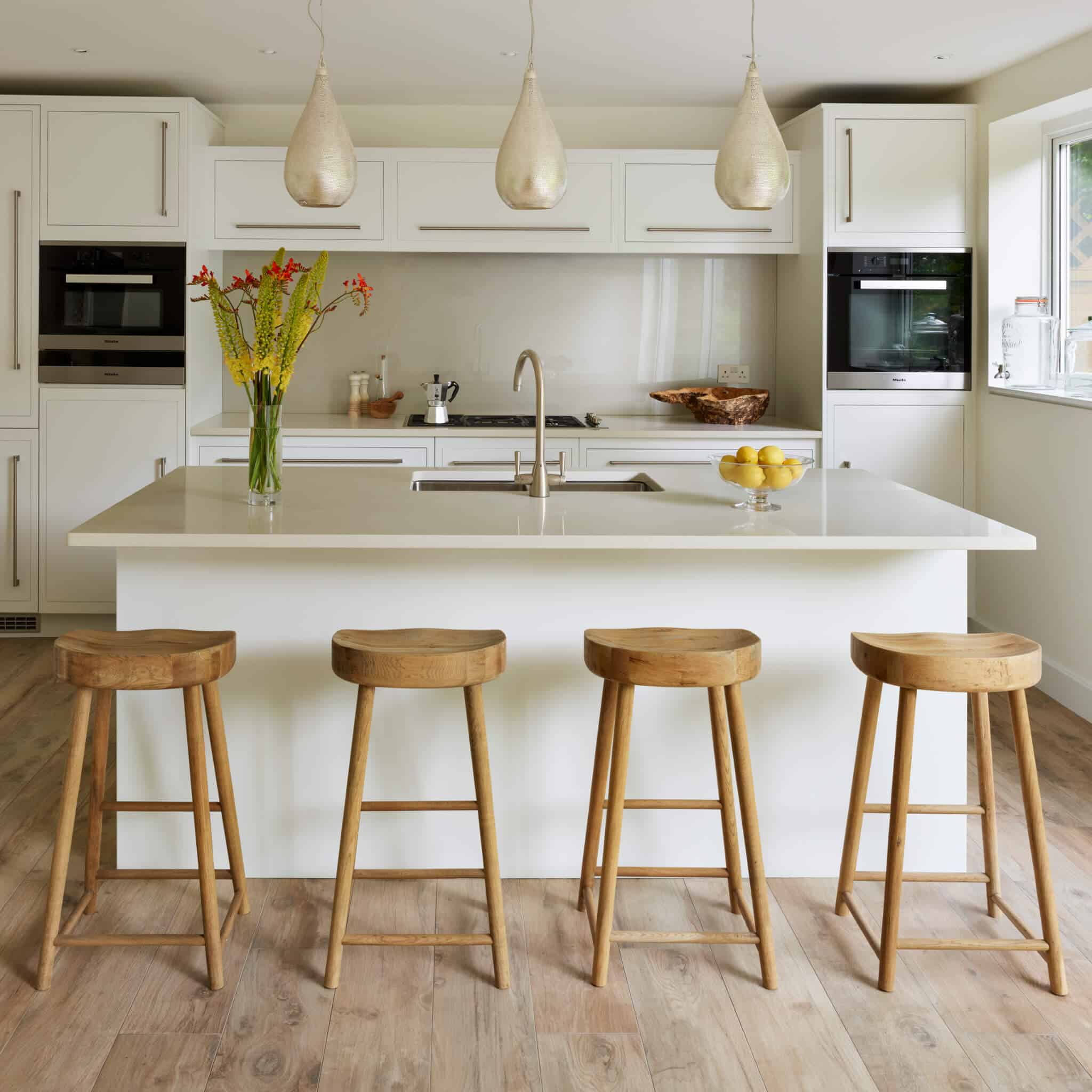
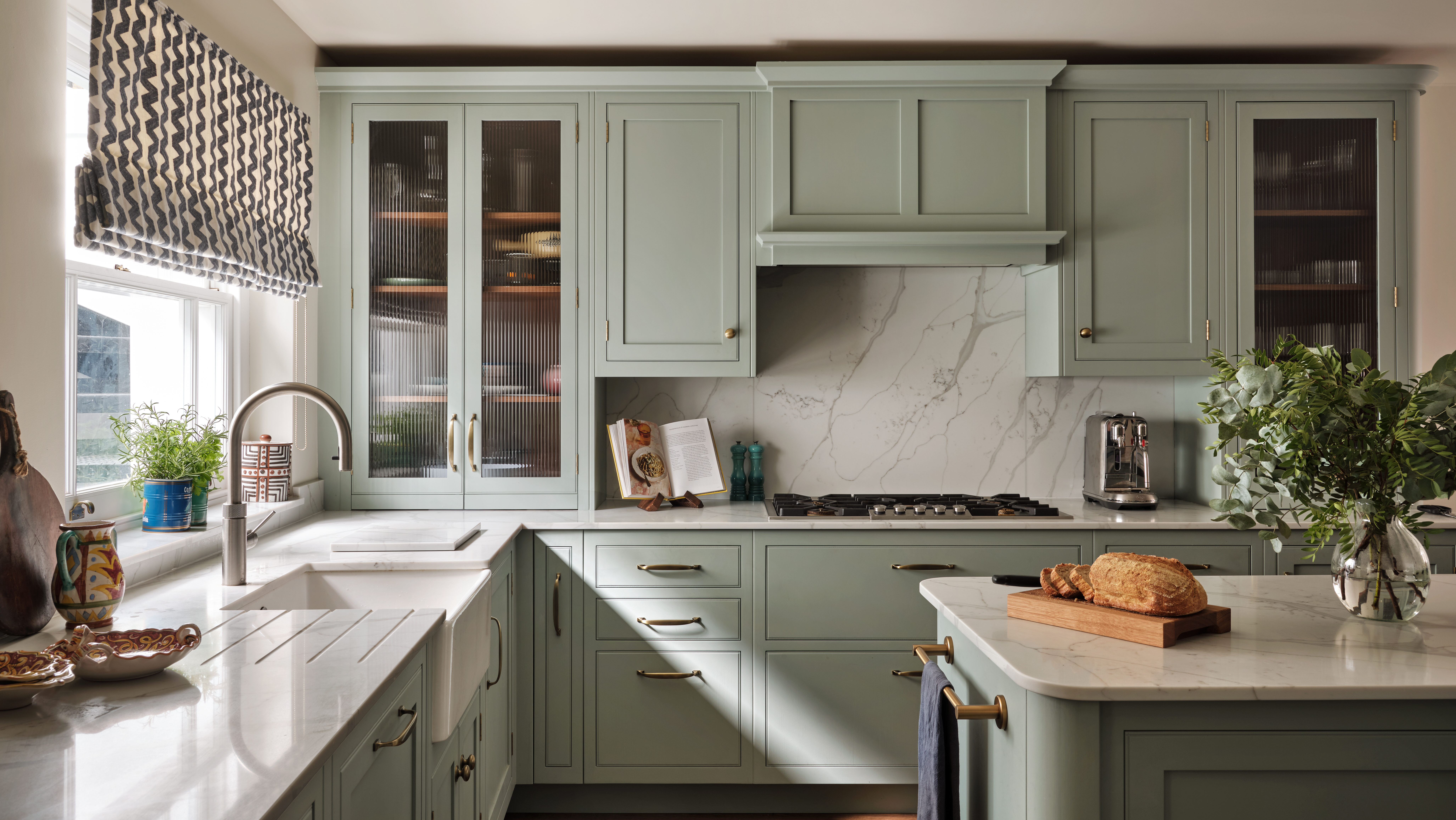
Lighter colours such as whites or pastels create the illusion of a larger space, while darker colours can make your room seem smaller. If you have a small, narrow or low-ceilinged kitchen, you would be better off steering clear of shades like black, navy or maroon. These may cause the area to feel claustrophobic, and rather than feeling inviting and cosy, you could be left feeling discomforted. That being said, you don’t have to stick to white. There are many chic pastels (duck egg blue or pastel pink, for example) that are increasingly popular right now. Or, if you’d prefer to avoid trends and go for a more classic feel, muted hues such as taupe and light greys might be the perfect choice. Rather than opting for white everywhere, use it tactfully by incorporating it into your colour scheme in specific areas. This will make your kitchen look bigger by adding more visual depth and helping to reflect light.
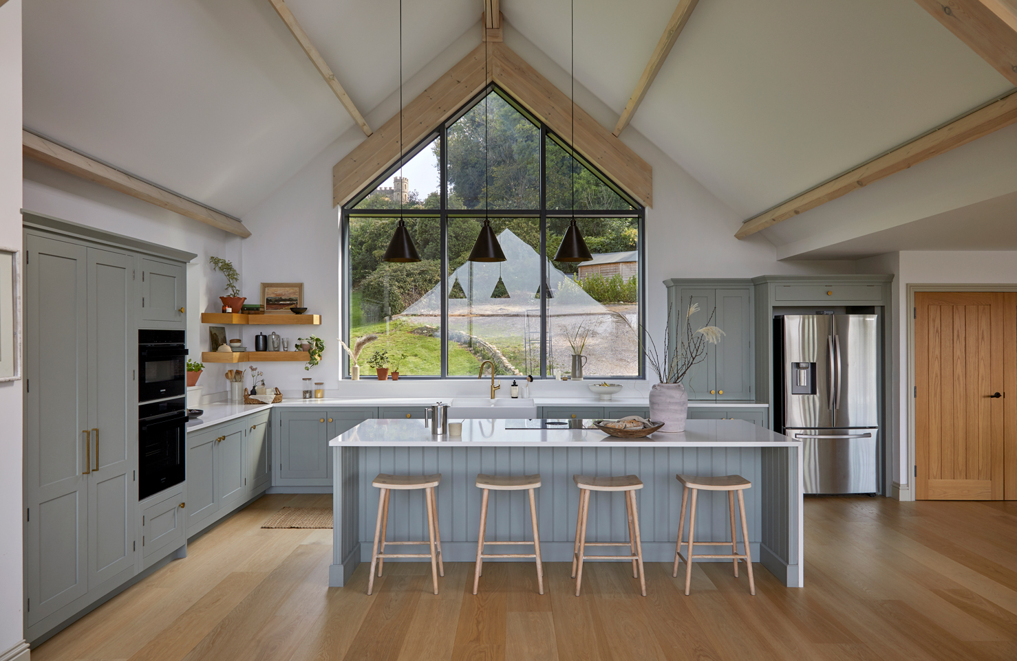
If you’re blessed with a big kitchen, especially if it has high ceilings, you can be far more adventurous with your palette. Seeing as most of us want the space to feel larger, you already have more to work with and therefore you can experiment with darker, more dramatic colours. A stylish navy can add a splash of coolness to your space without taking away from its appeal, while bold and bright hues like orange or yellow are perfect to draw the eye. Unlike in smaller rooms, whites should be avoided as they tend to make the area seem sparse.
The lights
How much natural light your kitchen has can heavily influence your colour scheme. For instance, a brightly lit room may wash out any lighter shades, while a dark space will benefit from vivid colours as they make it less gloomy (how can a kitchen with striking teal cabinets feel sombre?). The direction your kitchen is facing should also be taken into account. The natural light in a north-facing room would usually have a blue quality, a south-facing space can become overwhelmed with sunshine, and an east or west-facing kitchen will have the angle of light change rapidly throughout the day, impacting your colour choices. And, of course, the type of artificial lighting matters too — crisp, white LED spotlights give off a very different atmosphere to a warm Edison bulb, for example.
When considering the lighting in your kitchen, it’s important to remember that light transforms the appearance of colours. A navy cabinet might look black in a shady room for instance, while bright blue may appear green if you’re using yellow-tinted bulbs. So, before committing to a particular colour scheme, try to book a hand-painting on site, which will allow you to test the hues in their natural environment. At Harvey Jones, we take pride in the limitless colour choices that we offer, so our hand-painting service gives you full freedom and control to colour match the exact shade you want for your kitchen, making it very popular with our clients.
The style
You want your kitchen to suit the rest of your home. If your entire house sports wooden antique furniture and a homely, eclectic ambience, then a cold white, uber-contemporary kitchen could look out of place. At the same time, if your dwelling is super minimalistic, creating a kitchen filled with ornate detailing and rich hues of scarlet and gold, just wouldn’t work. The kitchen needs to fit both the overall style of your home and your personal taste. Think of the architectural elements adorning the room — does it have any interesting features like pillars or a kitchen island, for example? Your colour scheme might emphasise one of them, to dictate the nature of the space, turning them into a centrepiece that your chosen shades support.
The worktop and flooring
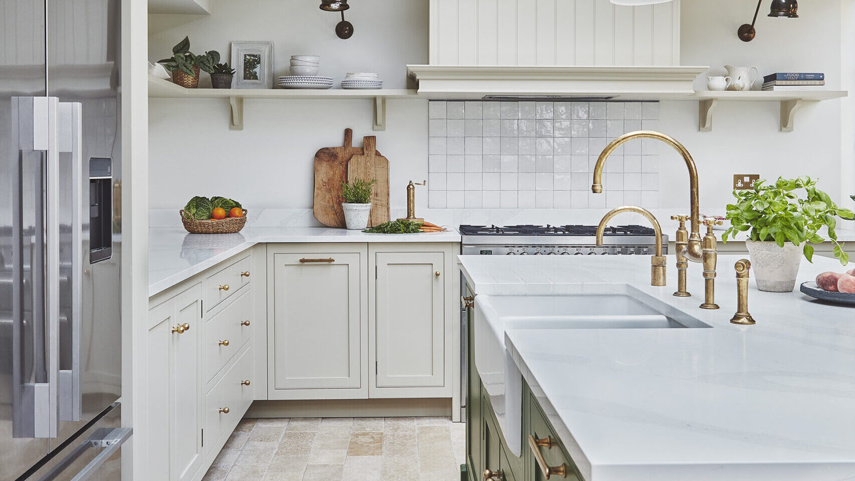
The hues of your kitchen aren’t only composed of your cabinets and walls (although, they can both add some interesting splashes of colour). A huge part of this room is the flooring and worktops. You’ll want your colour palette to compliment when necessary and contrast where appropriate, so try to look at how everything works together including any fixtures like ovens or fridges. Wooden floors may call for more rustic, traditional shades — think browns and natural tones. Modern tiles can be used to provide a focal point on a backsplash or help to divide a space when used on the flooring, these could be patterned or smooth and are available in pretty much any colour you wish. Consider whether you want those elements to act as a bold statement or mesh into your scheme. If you go for a muted floor, like concrete or wood, you may opt for a brighter, more daring shade in your colour palette than if your floor was adorned with bright orange tiles, for example. The same applies to your worktops (as well as any appliances). Monochrome quartz or Corian might benefit from a bold colour to add some depth. Or, if you chose a statement fridge in a lively shade of red, yellow or even pink, you may want to tone the other colours down and stick to blacks, whites and greys.
What colours should I paint my kitchen?
Now that you have considered all the necessary elements, it’s time to take a look at some kitchen colour scheme ideas. Generally speaking, there are three main combinations that can influence your decision.
Analogous
In order to understand analogous colour combinations, we first have to look at the colour wheel. This helps us understand relationships between colours, which is particularly useful when we come to match shades. An analogous colour combination is when you pick hues that sit next to each other on the colour wheel. Yellow, green and brown; navy, light blue and teal; blue, purple and maroon. As you can imagine, this choice can very easily descend into chaos, so it’s important to pick one of the tones as your main one and have the others as accents. So, for instance, use brown as the dominant shade if you pick the first example and use green and yellow as accent colours to add little splashes of colour in your decor.
Monochromatic
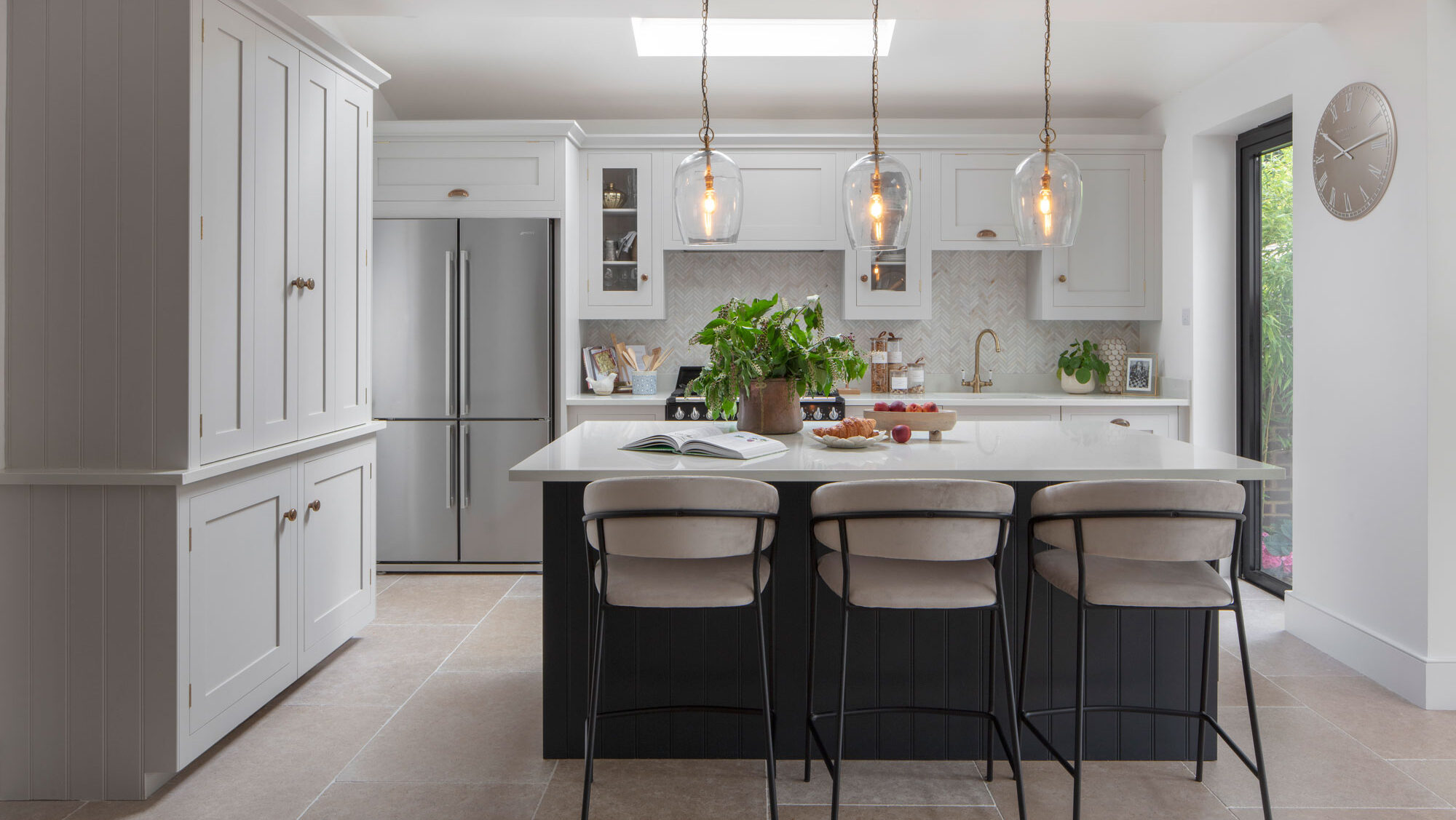
If lots of colour is not really your cup of tea, a monochromatic palette will likely be the best choice. Choose a main colour, and use different hues of it to create your scheme. Perhaps the easiest monochrome look plays on shades of grey and white (which would be complemented with a bright one, such as yellow or orange, if you’re willing to stray). However, a few tints of the same colour, like this grey shaker kitchen would create a harmonious and inviting look without being too all over the place.
Complementary
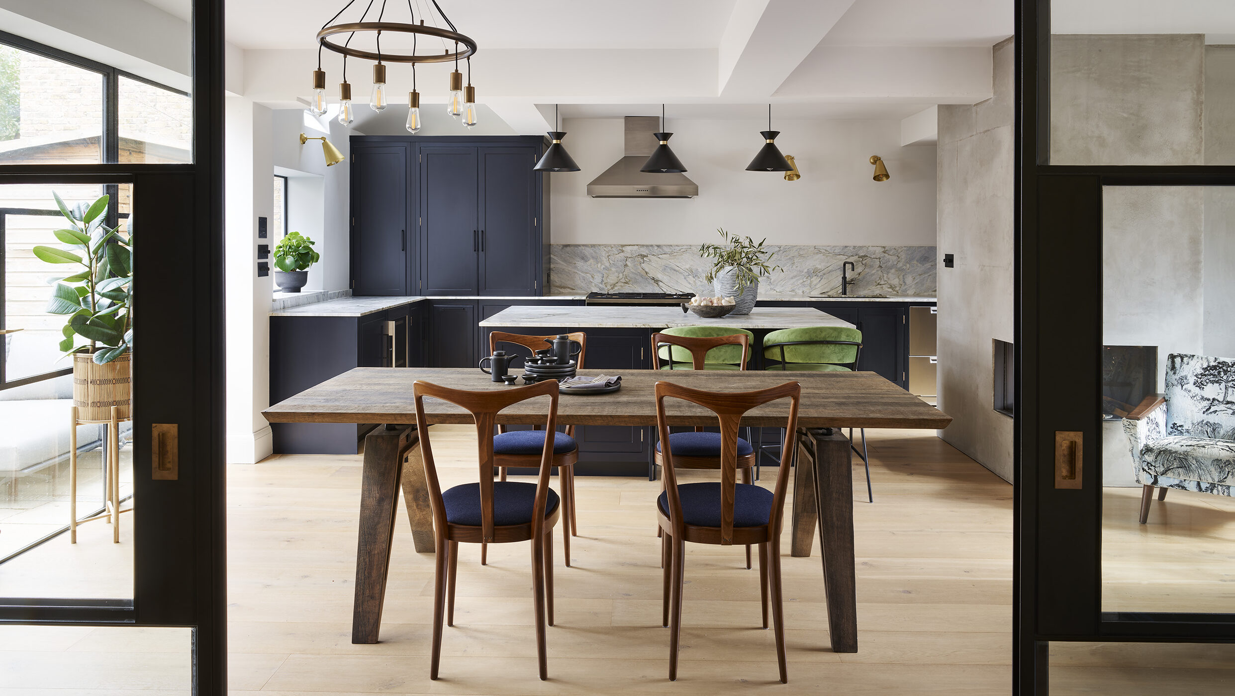
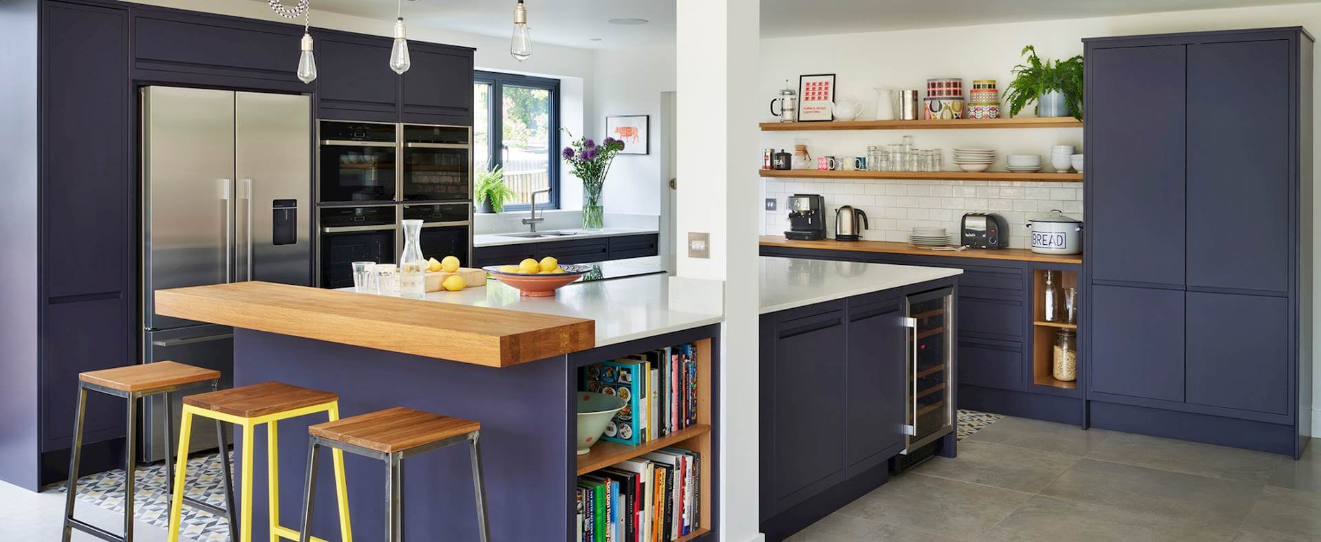
If you’re looking for a chic palette that is also bold, look no further. Complementary shades sit on opposite ends of the colour wheel, and, when done right, create a lovely juxtaposition that entices interest without trying too hard. However, they can easily become jarring, so make sure you’re not overdoing it. Shades of navy and purple can work perfectly when combined with hints of yellow or orange and act as a great complementary combination such as in this Linear Edge kitchen. Use the bolder shades in moderation, for example in this kitchen the hints of yellow in the tiles and accessories such as the stools and soft furnishings, give interest and personality without overwhelming the space.
Whichever colour scheme you choose, at Harvey Jones we pride ourselves on creating amazing bespoke kitchens for every need, in every colour palette. Get in touch today for a consultation.

