This month we welcome Ruth, the mastermind behind Design Soda, to share her passion for all things design. We share a love of colour and encourage using it in abundance around the home.
1. Tell us about yourself and what you do.
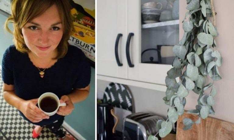
I’m Ruth, an interior design blogger from London. I live in a Victorian semi with my husband, 3-year-old son, and our cat, Dinah. I started blogging in 2013 to document my passion for interiors and our renovation journey. Since having a baby three years ago I have only returned to my old job one day a week and spend the rest of my time working in interiors, either on my blog, planning renovations for clients, working with brands or writing for websites.
2. Where did your passion for interior design come from?
I’ve always been interested in interiors, from childhood I was quite particular about the look of my bedroom, pitching various ideas to my parents at primary school age. I knew how I wanted things to look and would always know if something was out of place. Since buying our first home in 2007 my passion has grown to become my profession and area of knowledge.
3. What is your design mantra?
I’m a firm believer in following your instinct with design and not allowing doubt or nerves to quieten your gut feeling. I like design that doesn’t feel too serious or contrived, so I steer well clear of tear sheet looks or mirroring trends too heavily. I like to use colour throughout the house to create mood, and it’s often the first thought that guides the planning of a new space. I hold tight to William Morris’s practice “Have nothing in your home that you do not know to be useful or consider to be beautiful”.
4. How does this reflect in the design of your house?
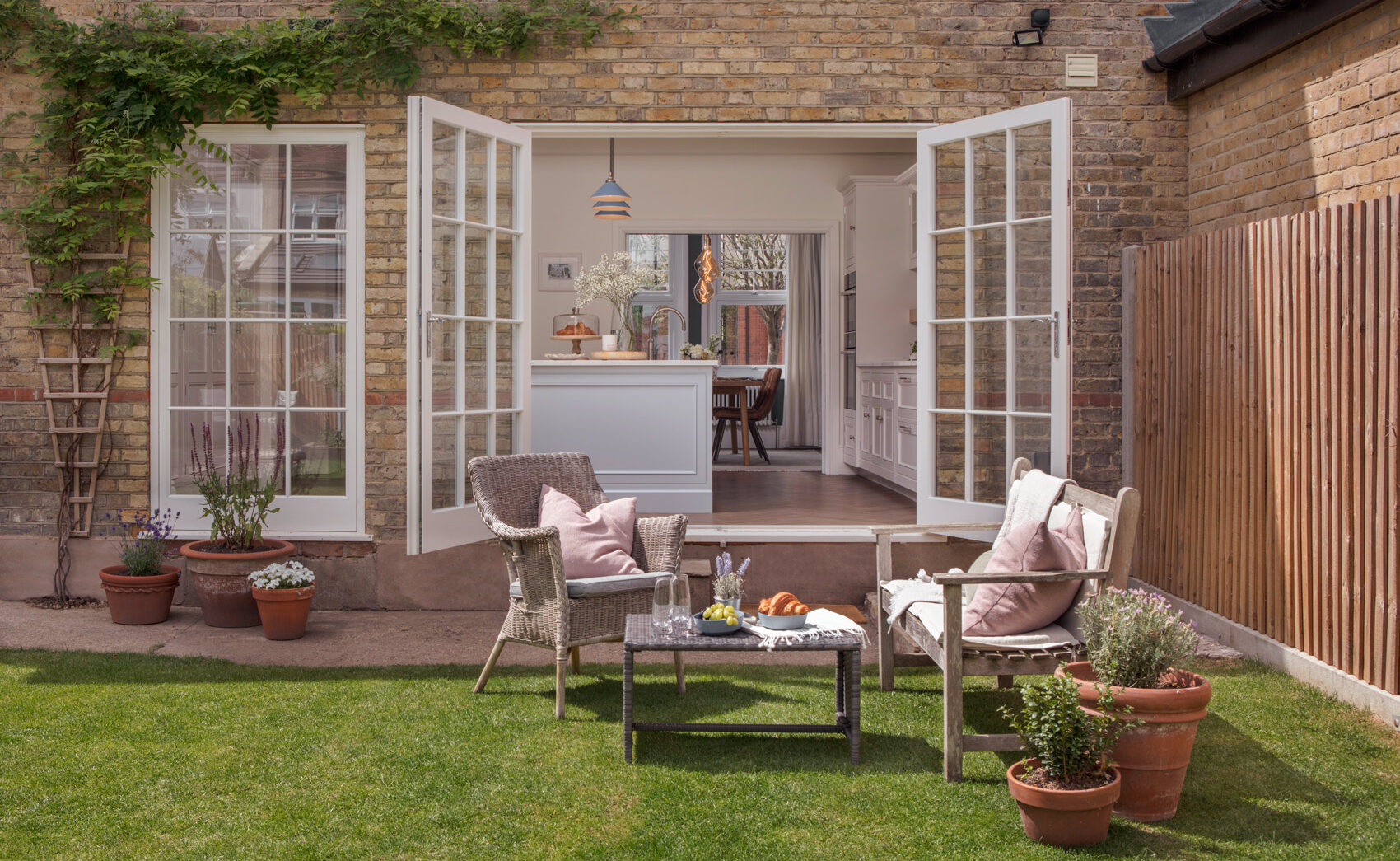
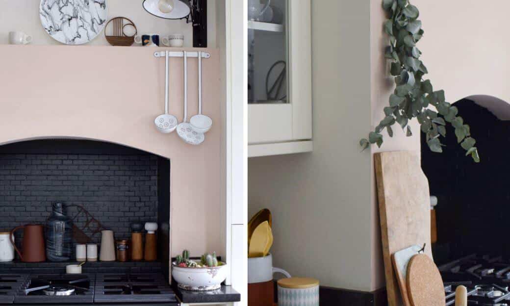
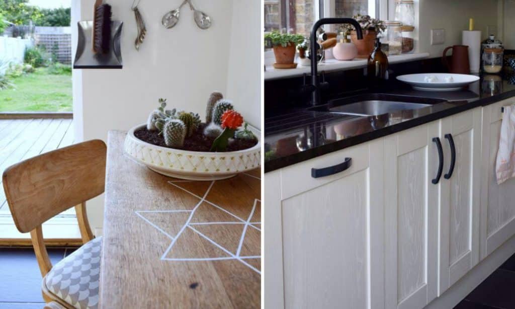
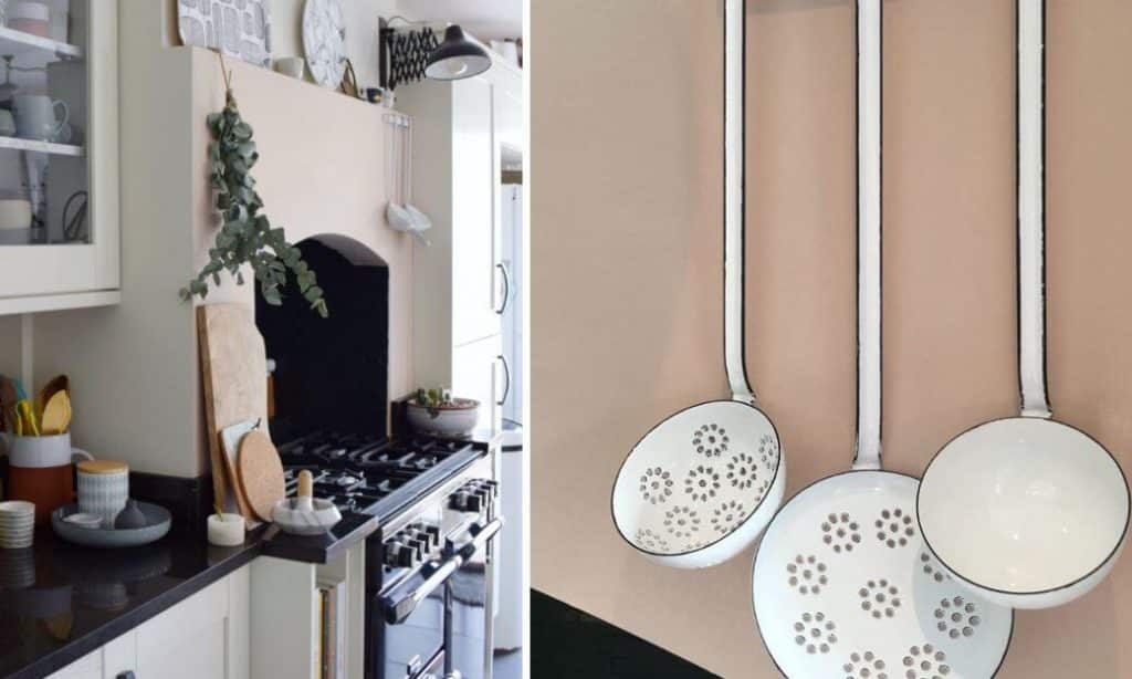
Each of my rooms have colour and vintage elements, most of my use of colour is reasonably subtle, for example our kitchen is quite narrow, and I wanted off-white stone coloured walls but the chimney breast is painted in a blush colour similar to freshly skimmed plaster. I love modern design and have it in every room, but for me vintage pieces always add a layer of storytelling and personality to a space. In rooms that have high traffic like kitchens and bathrooms this can be tricky, in our bathroom everything was new except for the vanity unit which I sourced on eBay choosing an old teak record cabinet for a non-traditional use. In the kitchen we have spotlights, but the light at the end (above the vintage kitchen table inherited from my grandma) we have a vintage light pendant from a railway station waiting room. Little touches like this really ground a room for me, and you’ll find something old in all of my spaces.
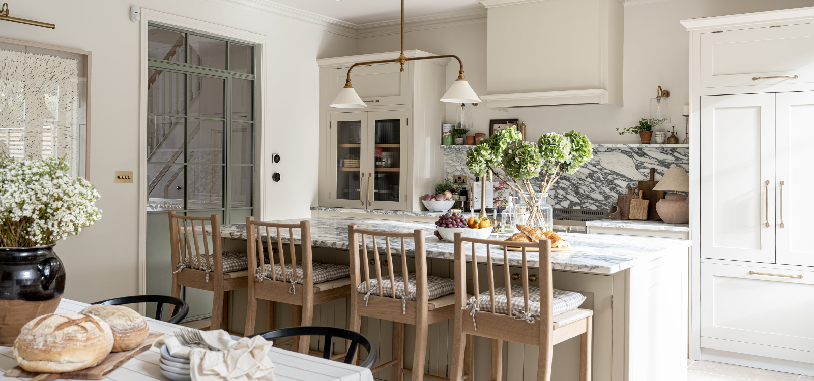
5. Have you noticed any new trends in the kitchen?
Kitchens feel much more individual than they used to. Materials have really diversified, marble has obviously been massive, but I’ve also loved seeing the use of parquet flooring, concrete surfaces, plywood cabinets, even terrazzo. Our kitchen tap is black, and I think black is about to become the new brass for all sanitary hardware in the home. I think we’ll also start to see the use of pale woods.
6. If you had £250 to spend in the kitchen, what would you buy?
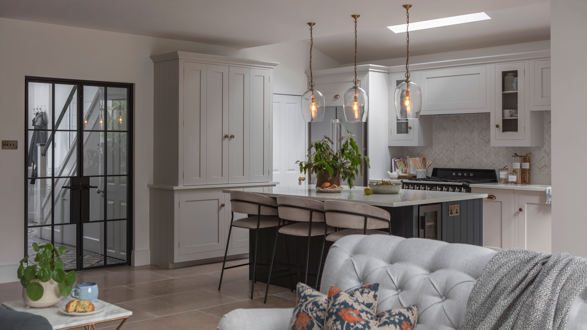
A beautiful piece of statement lighting. Good lighting has a huge impact on the feel of a space, I would most likely invest in a beautiful fitting which lifts the gaze.
7. What colour(s) should we be using in the kitchen?
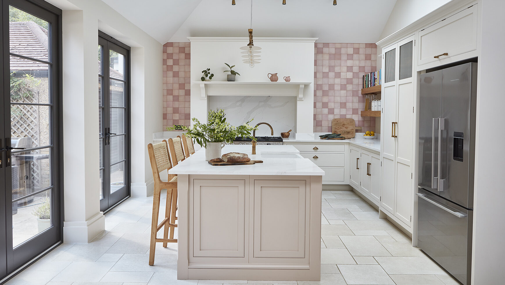
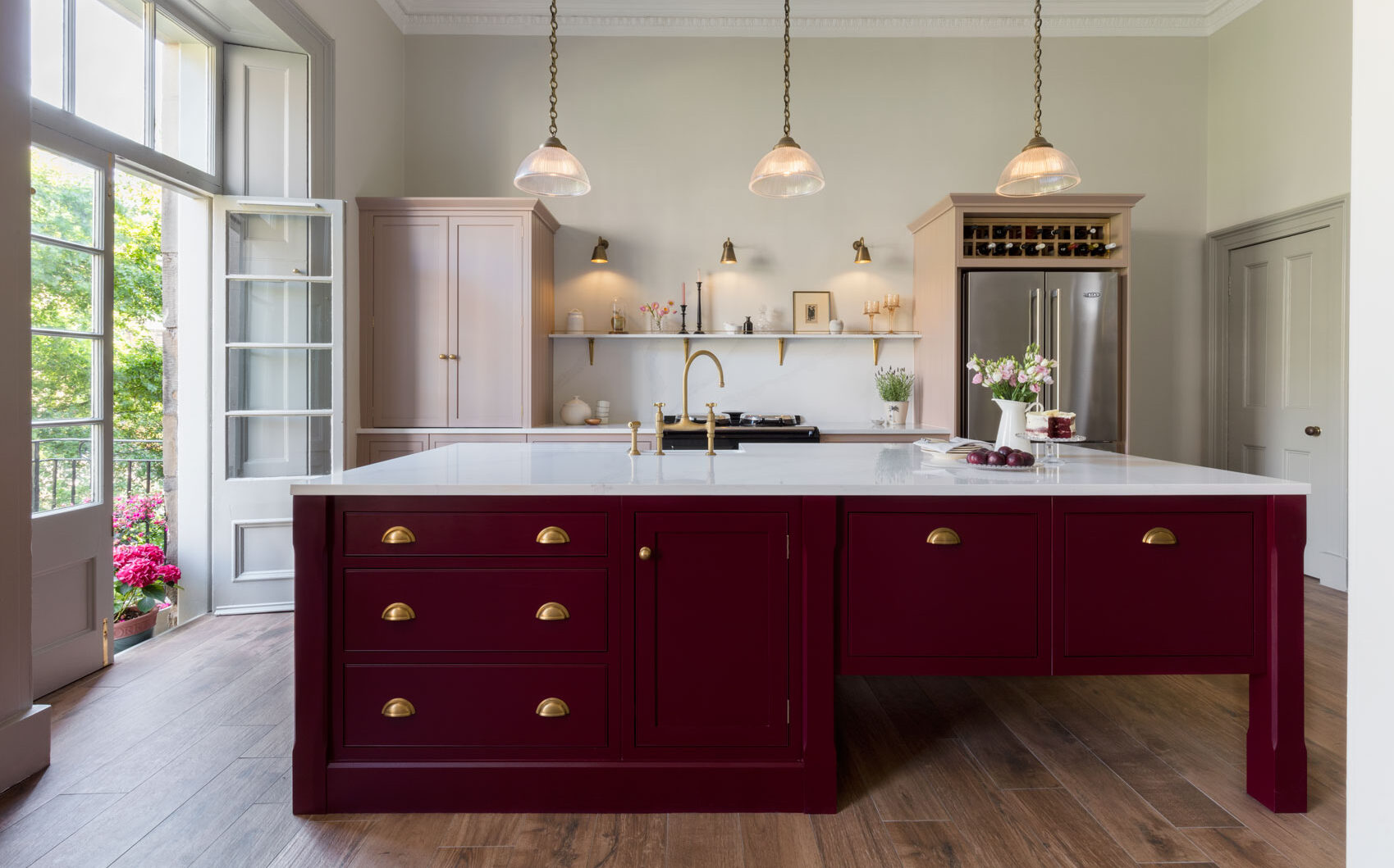
I love how adventurous people have become with colour in recent years, and the move away from clinical white in the kitchen is very welcome in my eyes. I think we are moving on from classy darks towards soft neutrals like greige and pastels which both feel very fresh, especially when weighted with darker accents. Personally, I’m currently considering a biscuit shade for the walls in our kitchen and a burgundy for the lower cabinetry.
8. What are your three top tips for decorating shelves in the kitchen?
- The first thing I’d think about is practicality; in an area of heavy use you need your essentials readily to hand so plates and bowls are within easy reach, moving upwards to lesser used items like vases, pitchers and pretty kitchenalia.
- Plan in dead space, it’s a simple rule of design that things look far better on display when they have space to breathe. Also, it’s quite likely that you will see beautiful pieces from time to time that you will want to add so leave enough room to accommodate them!
- As with my room schemes, I like to mix up styles and eras, so in our kitchen I display a mix of modern Scandinavian ceramics and dinnerware alongside vintage Italian coffee grinders, weighing scales and packaging. A little contrast can go a long way to create interest and interrupt a perfectly thought out, but slightly sterile, collection.
9. What are your kitchen must-haves?
I want my everyday items to be beautiful, they don’t need to be ornate but simple pieces that elevate everyday common use are what bring joy to a space. Beautiful plates and bowls are something that a lot of people invest in and with good reason. But there are other items in the kitchen that get used all the time but can be overlooked in the design stakes. The kettle is an item which most producers seem to spend very little time on the aesthetics of. We have a black kettle with wooden handle from Scandinavian designers Stelton in our kitchen, it’s pricey but each and every time I pick it up, I appreciate its well-thought-out beauty. You can’t really beat attention to detail in everyday pieces, as boring as it may sound, I put wooden spoons, ladles and colanders in this same category.
10. Where do you go for design inspiration? (websites, magazines, Instagram accounts etc.)
One of the key places I look for inspiration is in commercial design locally, I love visiting new cafes and bars in London and wondering about the details within them which really work for me. I look at lots of magazines for inspiration, long term favourites are Elle Decoration, Living Etc, Essential Kitchens, Bedrooms and Bathrooms Magazine, and my absolute passion is French interiors magazine Milk which always elicits a squeal of excitement when it lands on the mat! I also use online sourcebooks like Pinterest or Houzz when planning the inspiration stage of a makeover.
Quick fire questions:
- Pastels or primaries? Pastels, every time!
- Plain or patterned? Like trying to choose between favourite children, but overall, patterned.
- Chairs or stools? Chairs
- Wood or stone? Wood
- Aga or oven? Oven
- Industrial pendants or decadent chandelier? Industrial pendants
- Larder or utility room? Larder
- Cooking or eating? Cooking is no fun without the eating, especially if you have friends coming round!
- Instagram or Pinterest? Instagram
- Minimalist or maximalist? Maximalist
Keep up to date with Ruth’s take on all things design related via her blog and Instagram page.
Feel inspired by Ruth’s interiors advice? Speak to one of our expert designers to discuss your kitchen project. Call 0800 389 6938 or visit your local Harvey Jones showroom.