Over the past few years, the trend for colour specialists and paint companies to release their colour predictions for the year ahead has grown in importance, particularly for interior design. One of the most eagerly anticipated is the Pantone Matching System (or Pantone) colour of the year. Pantone is a standardised system that allows designers to colour match a huge range of specific shades, regardless of the equipment used to produce the colour. For many years it has been widely used by graphic designers and reproduction and printing houses and, more recently the interiors and fashion industries to identify colour trends for the years ahead.
Usually, Pantone colours are quite strong and can often take a while to kick in and gain traction. While 2018’s rich Ultra Violet and 2017’s initially felt a brave choice, and we’ve yet to see much aubergine and yellow-green on the High Street, it’s interesting to note that variations on 2016’s Rose Quartz are everywhere in interiors right now.

For 2019, Pantone has opted for rich Living Coral (also known as Pantone shade 16 – 1546) is described by them as “a nurturing colour that appears in our natural surroundings and at the same time, displays a lively presence within social media”.
Shades reflecting nature are popular after the brighter hues seen in recent years. Dulux announced a warming amber tone for 2019 that is set to become a new neutral as it works well with many other colours to create a harmonised and comforting base to any interiors scheme. Rather than one colour, Crown has focused on three separate palettes – Refined, which is a mix of cement greys and chalky pink shades; Movement celebrates cultural diversity with clashing colours such as inky blue, ochre brought together with subtle pale greys; finally Immersed takes its inspiration from water combining tonal blues and chalky whites.

Farrow & Ball’s latest launch included not one but nine new shades including the gorgeously dusky and wonderfully named Sulking Room Pink, a grey-green called Treron and De Nimes, an earthy French blue.
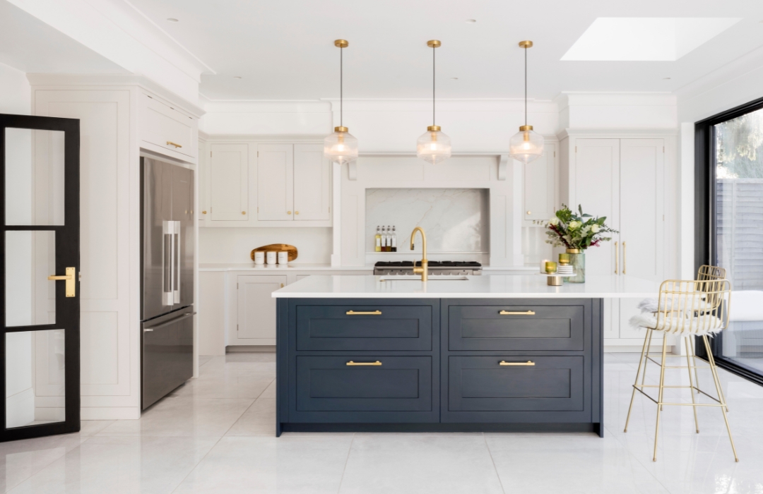
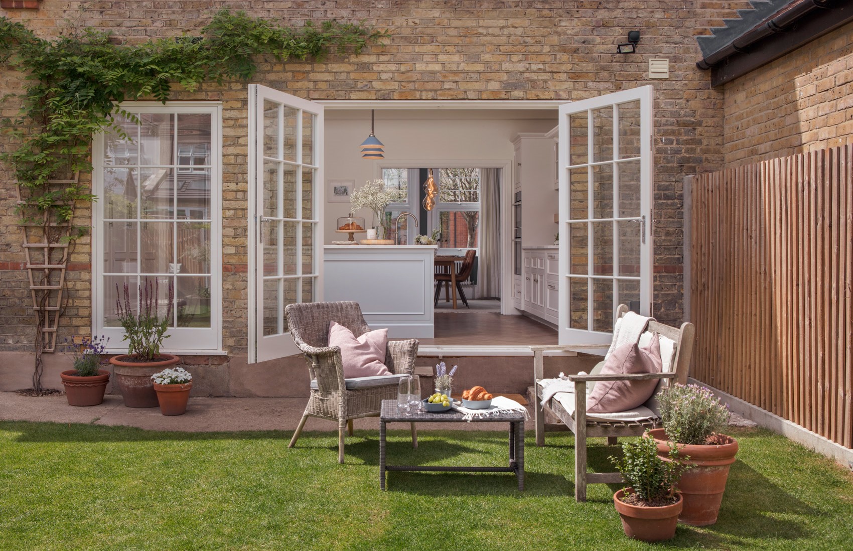
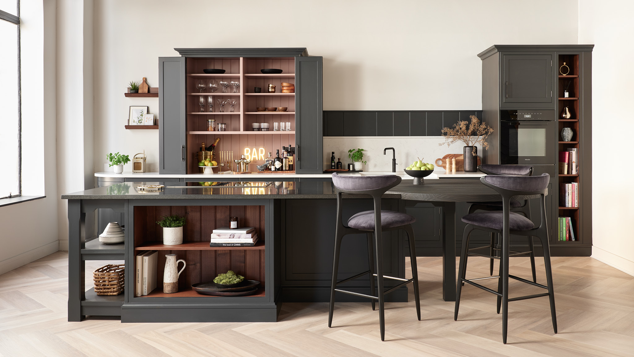
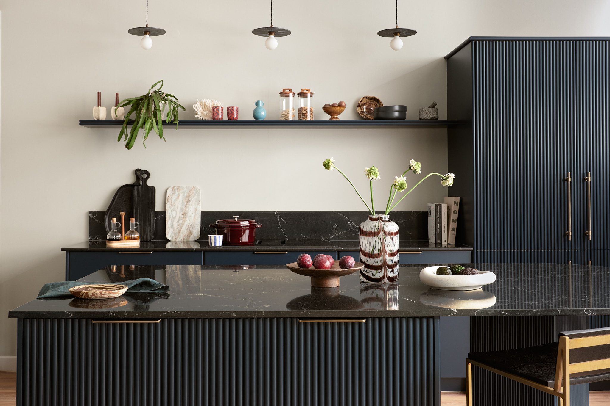
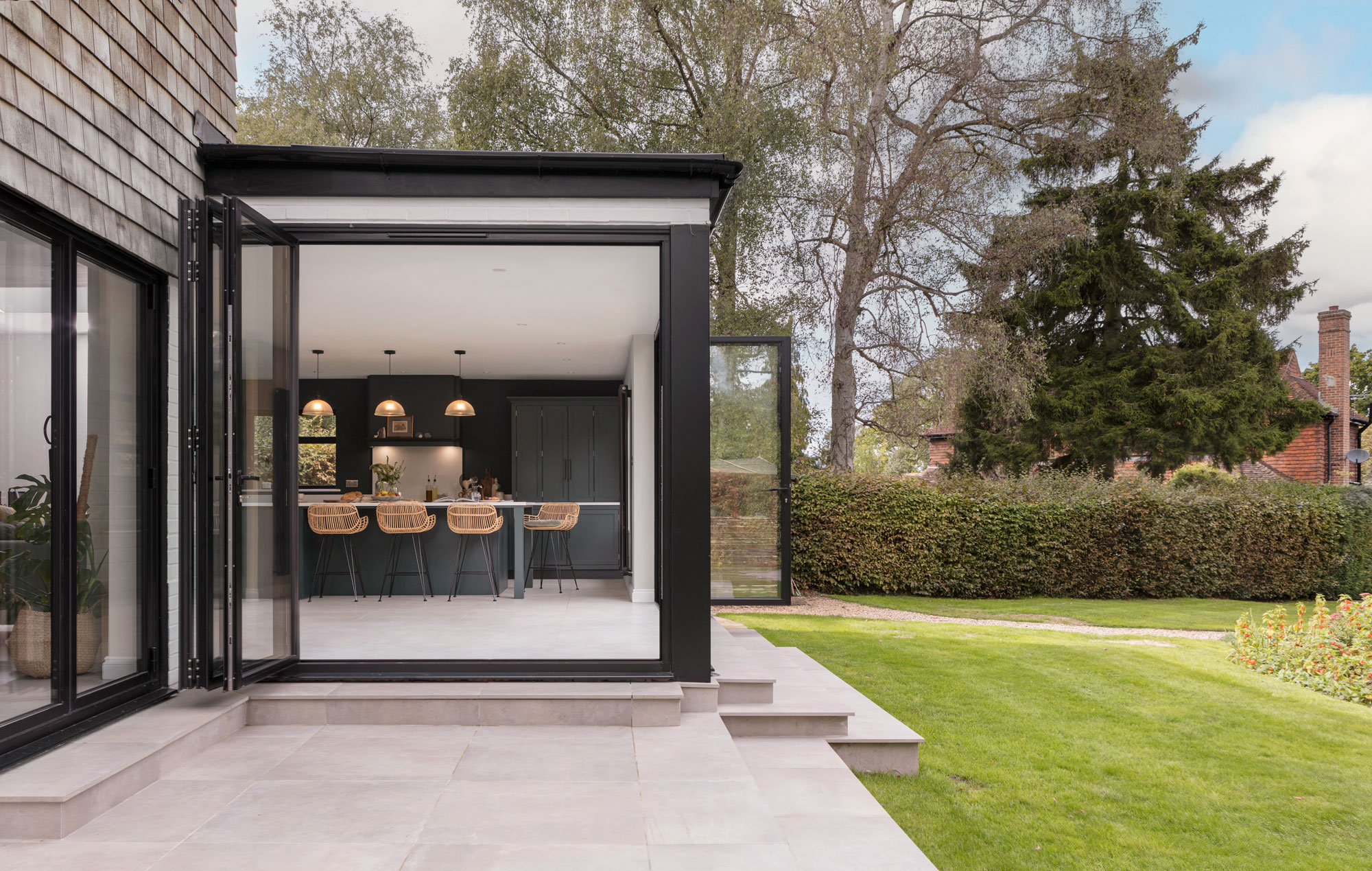
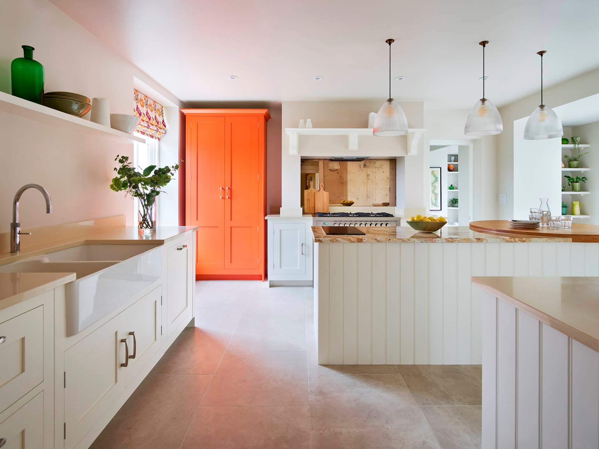
Visit our gallery for inspiration in the kitchen, or Instagram for our latest work. Alternatively, book an appointment in your local showroom and request a copy of our NEW brochure.