The right kitchen colour scheme can completely change how a space feels. Colour shapes the atmosphere of your kitchen, while influencing how light moves through the room and, in turn, helps define whether the space feels calm and timeless or bold and dramatic.
In a bespoke kitchen, colour also becomes part of the craftsmanship, highlighting cabinetry details, natural materials and, ultimately, the overall character of the design. The key is choosing colours that not only suit your home, but also feel right for the way you live every day.
In this guide, we explore the best kitchen colour schemes for modern British homes.
Discover real, bespoke kitchen & home inspiration.
Neutral Kitchen Colour Scheme Ideas
Neutral kitchen colour scheme ideas remain consistently popular for good reason. They are easy to live with, versatile and perhaps most importantly, they age well. A well-chosen neutral is far from boring. In fact, it’s the foundation of a refined, timeless kitchen.

1. White Kitchens
White is enduringly popular in luxury bespoke kitchens because it reflects light beautifully while also providing a clean backdrop for other design elements.
The key is choosing the right white. Bright, cool whites suit contemporary handleless designs. Softer, slightly warm whites feel more at home in Shaker style kitchens and particularly period properties.
Almost anything goes with white, so pair white cabinetry with natural marble or quartz worktops for a high-end finish. Introduce warmth through natural wood open shelving, pendant lighting in antique brass or unlacquered bronze, and textured tiles.
2. Grey Kitchens
Grey has been one of the most requested shades in high end kitchen design for well over a decade, because of the range of tones available, it’s remarkably flexible.
Pale dove greys feel serene and Scandi-inspired, whereas deeper charcoal and slate greys bring drama.
A grey kitchen works especially well in combination with natural wood tones. Pair cooler greys with light oak or limed ash for a fresh, Nordic feel alongside natural stone or quartz worktops. Pair warmer greige tones with darker walnut or smoked oak, as a result, your space will feel richer and more layered.
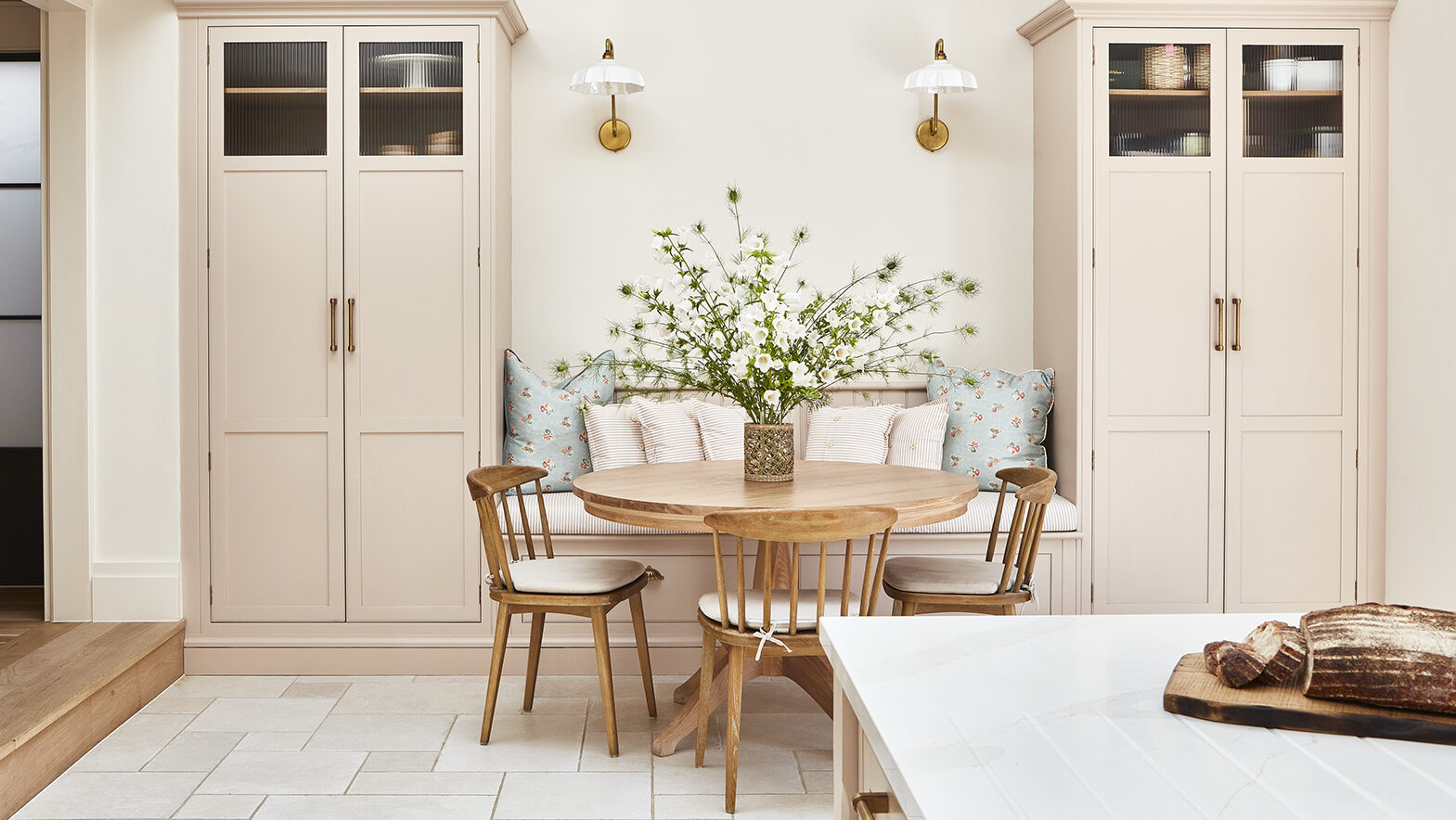
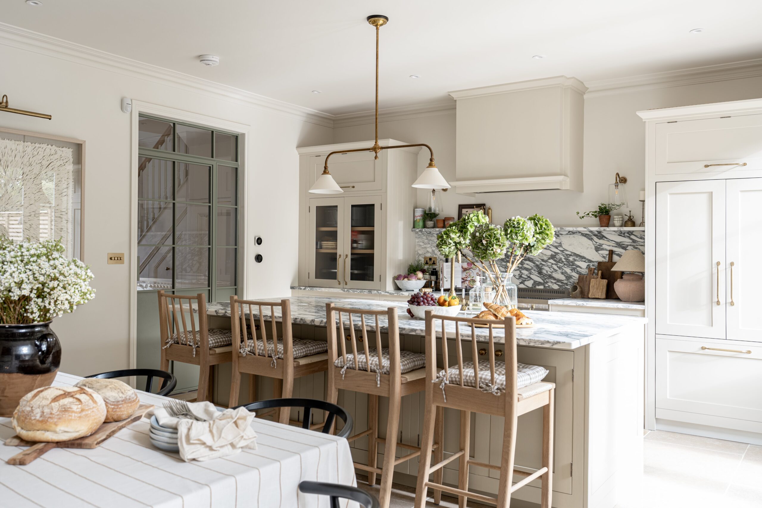
3. Cream and Ivory Kitchens
Cream and ivory sit between the crispness of white and the warmth of beige. Because of this, they are particularly well-suited to traditional country kitchens and period homes where pure white can feel too stark. A cream Shaker kitchen with an exposed stone floor and open wooden shelving feels genuinely relaxed and therefore, lived-in.
Ivory is also one of the most forgiving colours for a kitchen diner colour scheme because it bridges kitchen and living spaces naturally without demanding an exact match.
Josh, one of our expert kitchen designers, explains why neutral kitchens are such a timeless choice:
For a kitchen that feels classic long term, lighter neutral shades are usually the safest choice. Therefore, deep navy blues and strong greens can work beautifully, although they do tend to date more quickly than softer, more understated tones.
Bold Kitchen Colour Scheme Ideas
Bold kitchen colour combination ideas are having a sustained moment in bespoke kitchen design. If you are confident in your aesthetic and prepared to commit, a strong colour can transform your kitchen into something truly memorable.
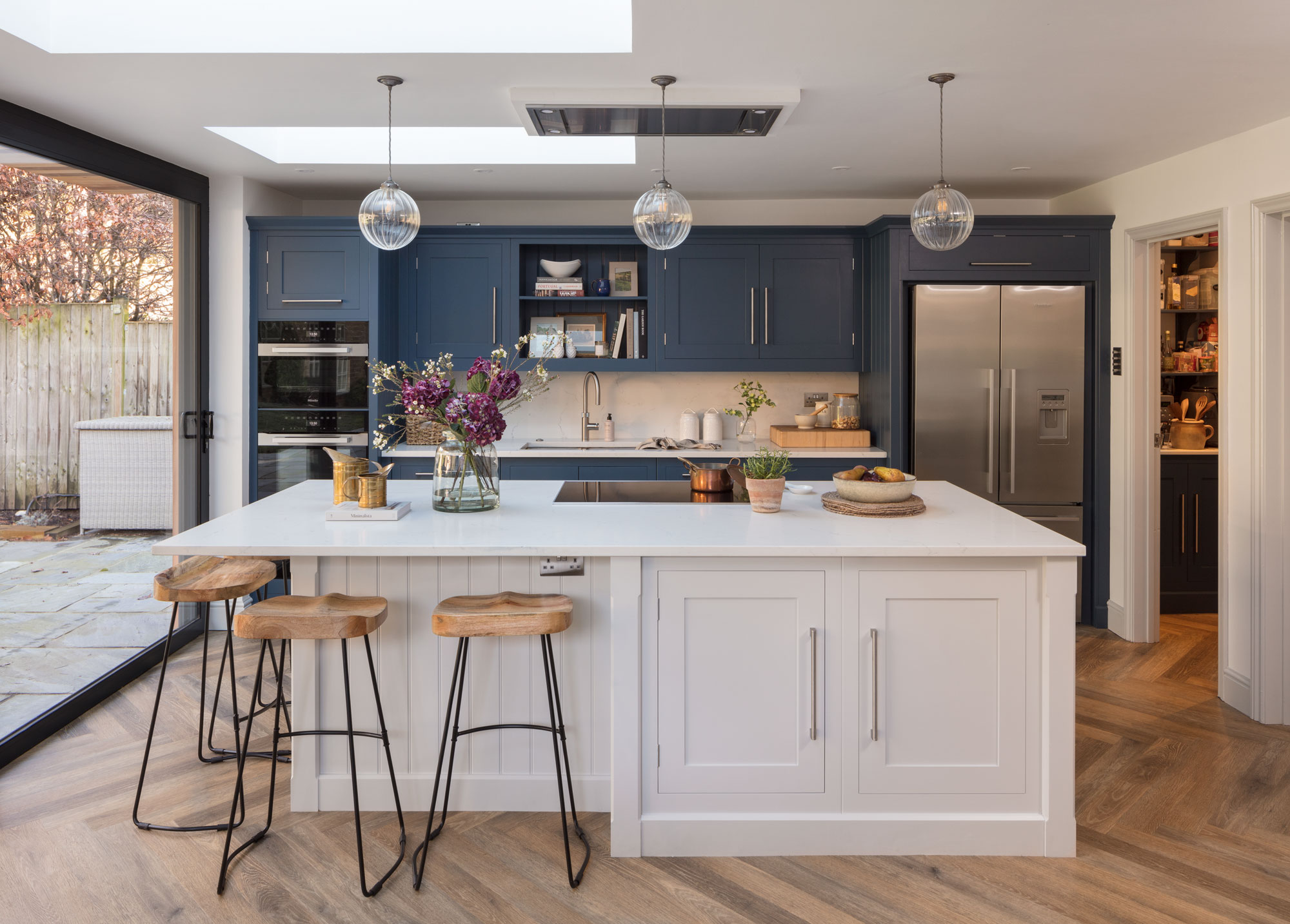
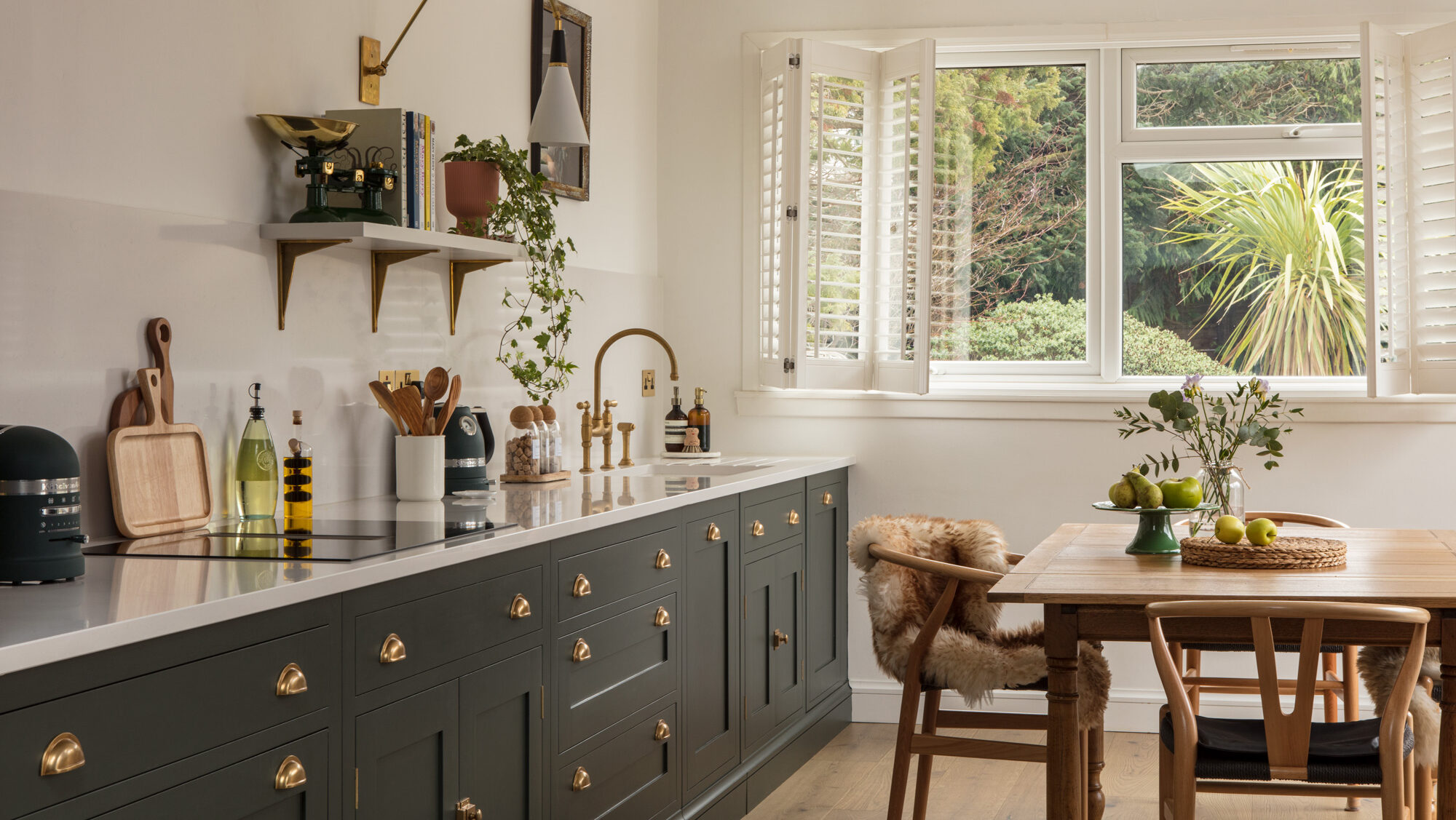
4. Navy Blue Kitchens
Deep navy blue cabinetry with aged brass handles adds instant character. It works beautifully in both traditional Shaker kitchens and equally, more contemporary handleless designs.
In a well-lit kitchen, navy reads as rich and therefore more sophisticated. Pair it with pale quartz or simple marble worktops to keep the space feeling light, and introduce warm wood tones through flooring or a natural oak island.

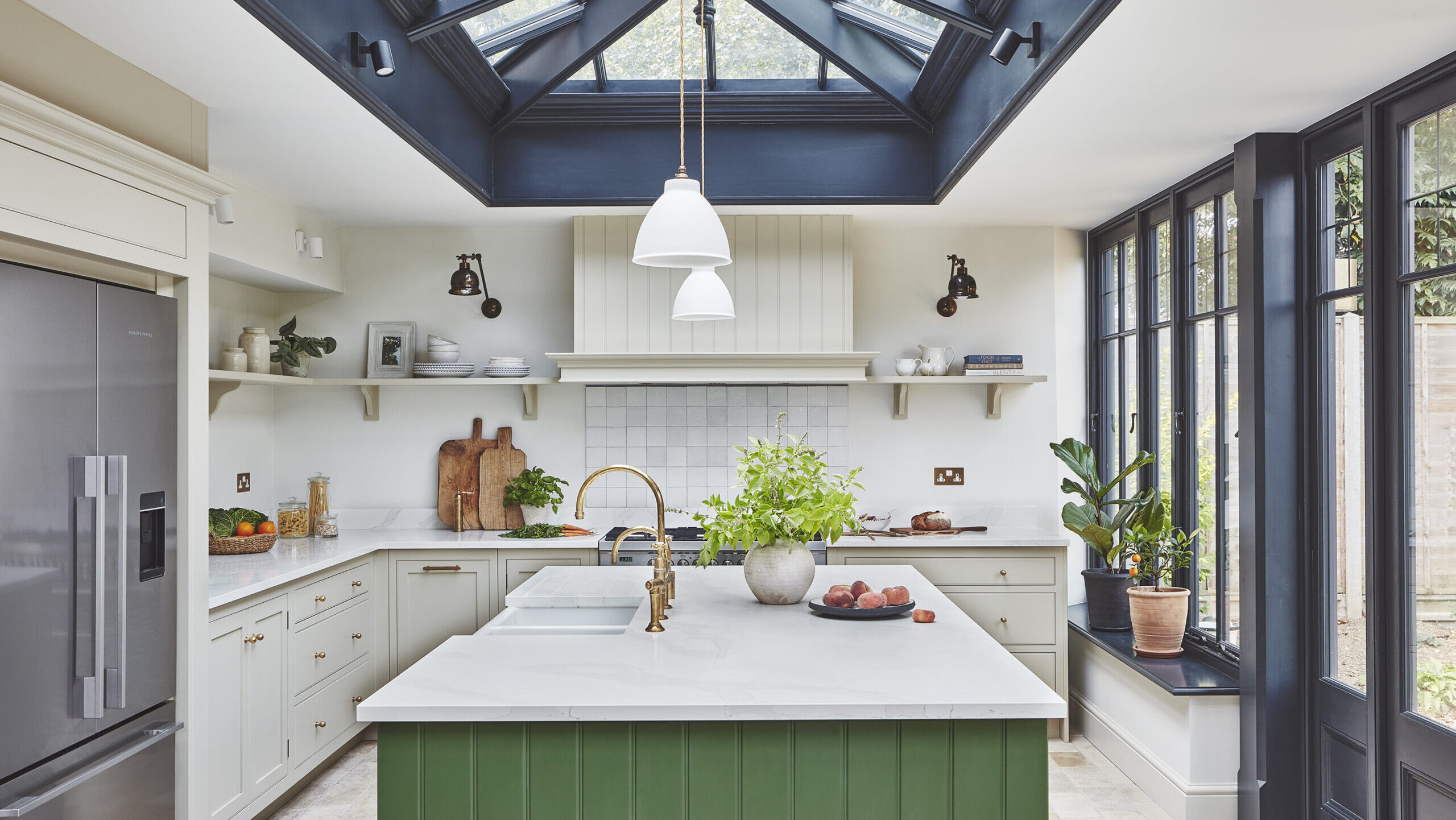
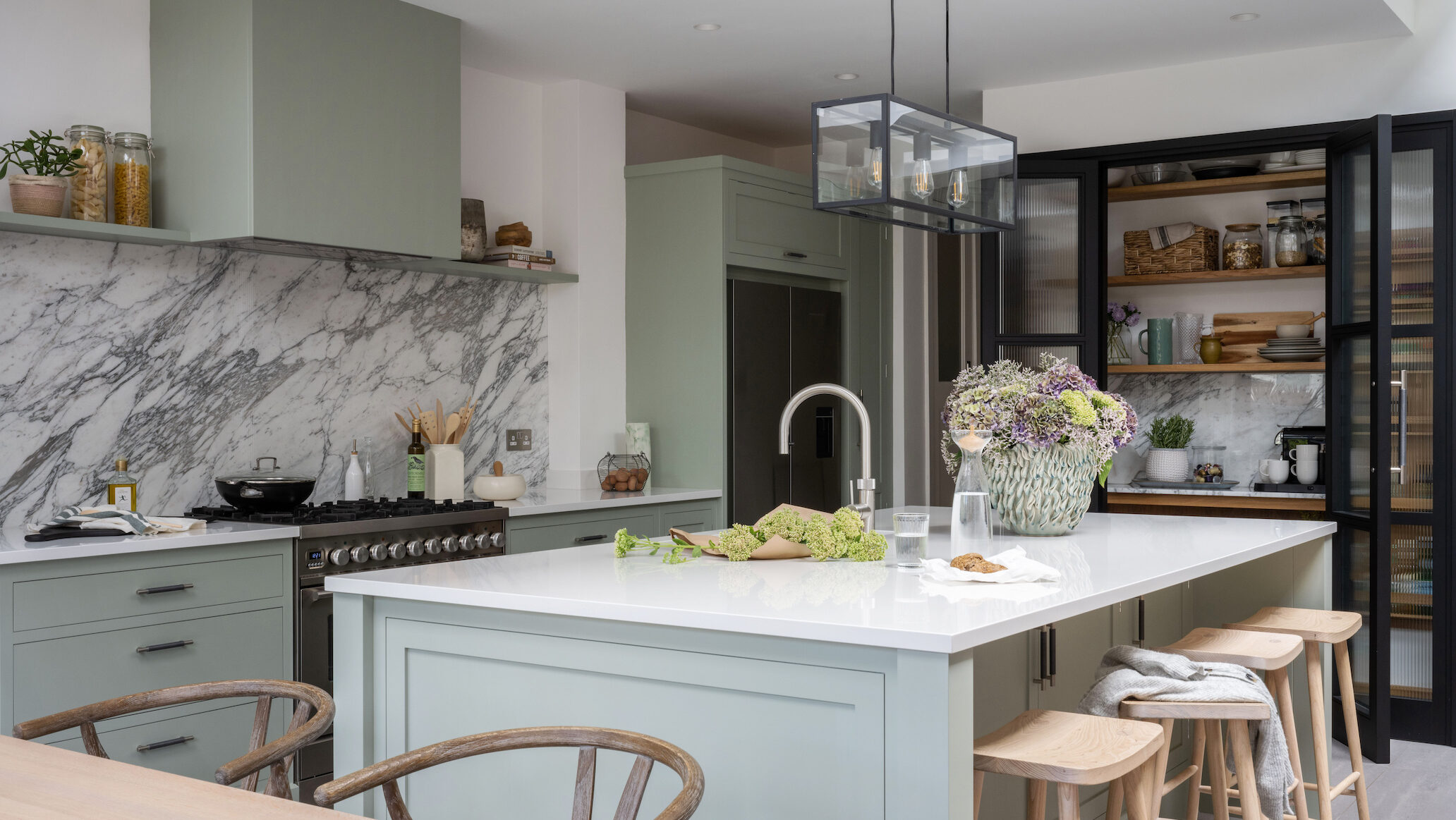
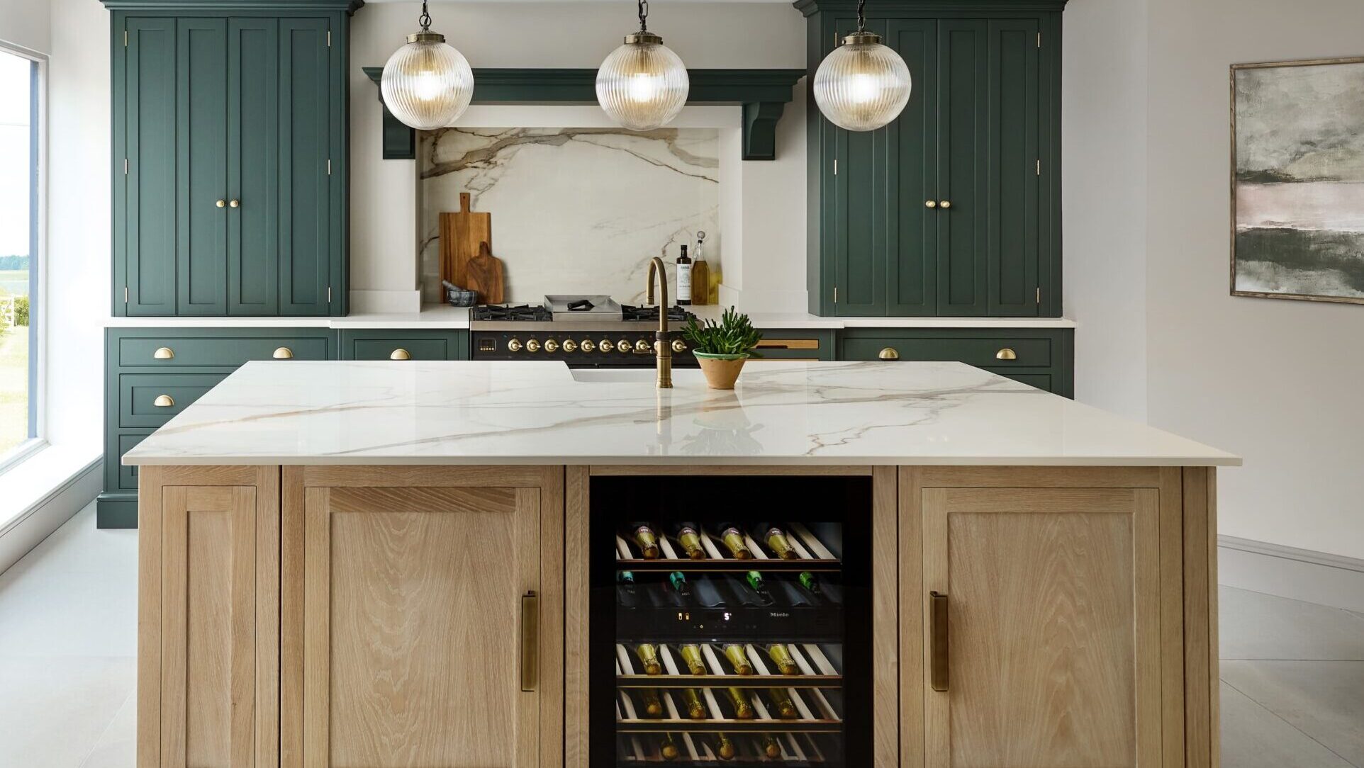
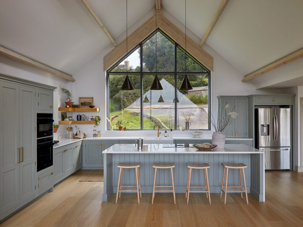
5. Forest Green and Sage Green Kitchens
Green remains one of the most requested colours in luxury Shaker kitchens.
Deeper forest and hunter greens create a moody, grown-up atmosphere that suits both country properties and increasingly, modern townhouses. Sage and soft olive greens are easier to live with every day and as a result, age particularly well.
If you’re designing a kitchen diner colour scheme, sage green cabinetry pairs naturally with warm white walls and natural linen tones through into the dining area.

6. Deep Teal and Blue-Green Kitchens
Blue-green tones occupy an interesting space between classic blue and contemporary green.
They work well in rooms with good natural light and pair beautifully with white marble worktops, warm wood floors and brass hardware or equally, classic brushed stainless steel hardware for a modern feel.
7. Rich Terracotta and Burnt Orange
Warmer earthy tones are growing in popularity as homeowners move away from purely cool palettes.
Terracotta and clay-inspired shades bring warmth and a sense of the handmade that suits bespoke painted kitchens particularly well. Balance with natural stone worktops and neutral walls.
Kitchen Colour Schemes for Every Style
8. Traditional and Country Kitchens
Traditional kitchen colour schemes tend to draw from nature with creams, soft whites, muted greens and warm greys.
Detailed cabinetry in heritage tones paired with a Belfast sink, wood or stone worktops and antique brass hardware creates the kind of kitchen that looks equally at home in a farmhouse or a period terraced house.
Classic combinations include cream perimeter cabinetry with a forest green island, dusty blue cabinetry with warm white walls, or pale grey with a natural oak larder.
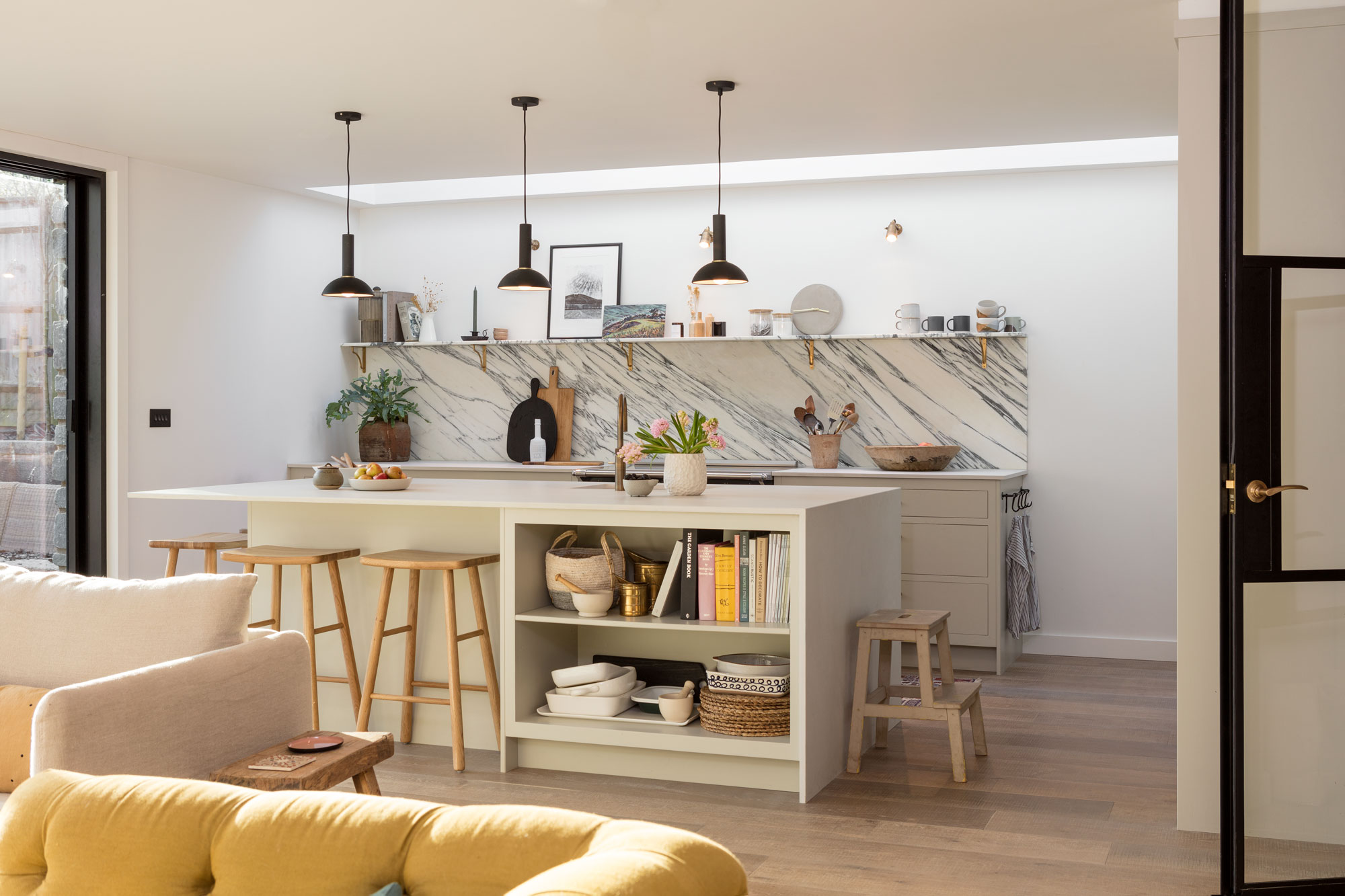
9. Modern and Contemporary Kitchens
Contemporary kitchen colour schemes often favour restraint. A single strong shade against a backdrop of white or light stone lets the architecture of the kitchen do the talking.
Handleless kitchen designs in deep charcoal, matt black or warm greige with integrated appliances and minimal hardware have a clean aesthetic.
Kitchen designer Josh explains how two tone schemes are becoming popular in modern designs:
We’re seeing a lot of interest in natural wood stains and softer neutral tones at the moment. Classic properties tend to suit lighter, more understated colours, while city homes are often where clients feel more confident introducing bolder shades.
Kitchen Colour Schemes for Small Spaces
A small kitchen colour scheme requires a little more thought, but the right palette can make a compact space feel significantly larger and, therefore, more considered rather than cramped.
Lighter shades remain the safest foundation because pale greys, soft whites and warm cream all help bounce light around and prevent the space from feeling closed in.
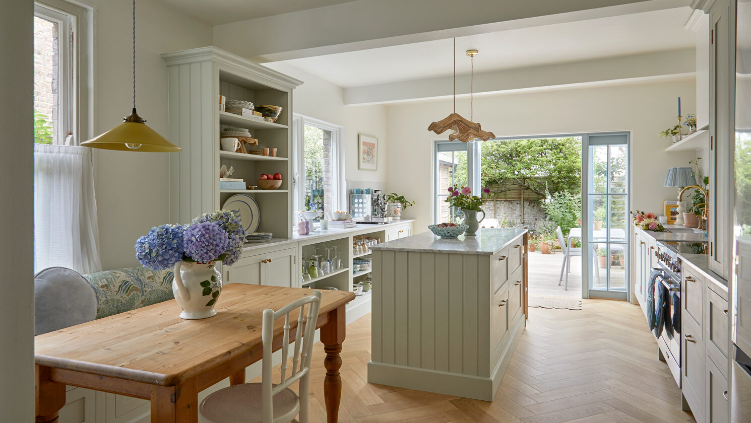
Popular Shaker Kitchen Colour Schemes
Bespoke Shaker kitchens are perhaps the most versatile, suiting almost any interior style. The clean lines of the frame-and-panel door work in almost every colour, from the palest neutrals to the deepest jewel tones.
Here are some beautiful kitchen pairings for your Shaker design:
10. Soft White
Cabinetry: Pure or soft white painted finish
Worktops: White or light grey quartz, honed marble
Hardware: Brushed brass, satin chrome or antique nickel
Walls: Warm white or pale linen
Flooring: Wide plank pale oak or large format stone
Best for: Smaller kitchens, period homes, north-facing rooms that need maximum light
11. Warm Cream and Sage Green
Upper cabinetry: Warm cream or ivory
Lower cabinetry or island: Soft sage or muted olive green
Worktops: Honed sandstone, brushed concrete or pale quartz
Hardware: Aged brass or matt gold
Walls: Off-white or pale stone
Flooring: Natural stone or terracotta-toned porcelain
Best for: Country kitchens, farmhouse settings, open plan kitchen diners
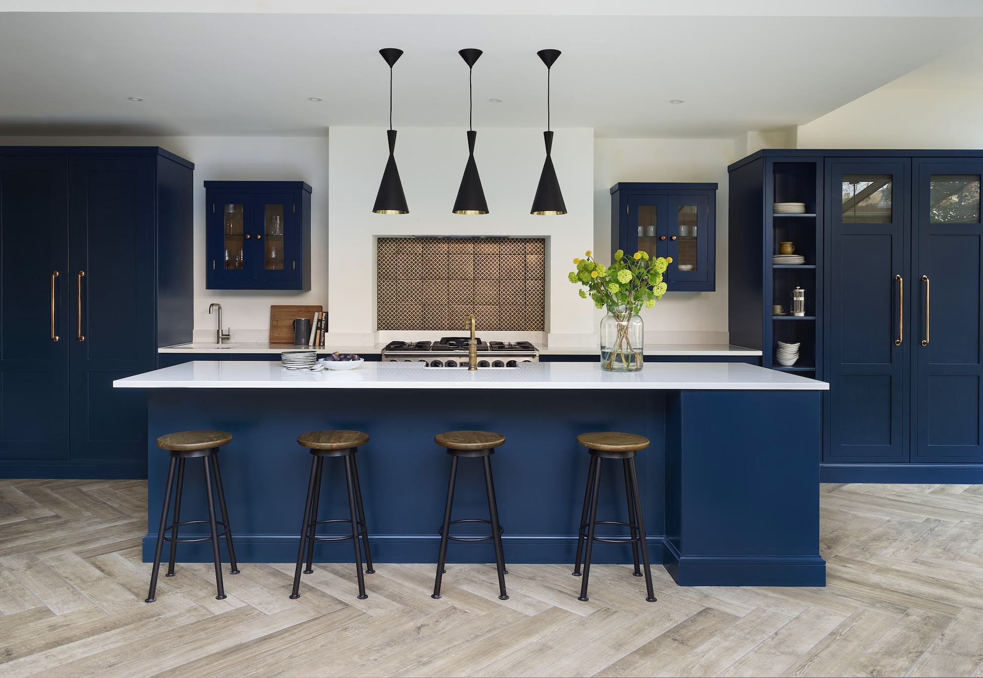
12. Deep Navy Blue
Cabinetry: Deep navy or inky blue painted finish
Worktops: Pale marble or crisp white quartz
Hardware: Aged brass or unlacquered brass
Walls: Soft white or pale grey
Flooring: Light natural oak or pale limestone
Best for: Well-lit kitchens, statement rooms, and equally, city townhouses
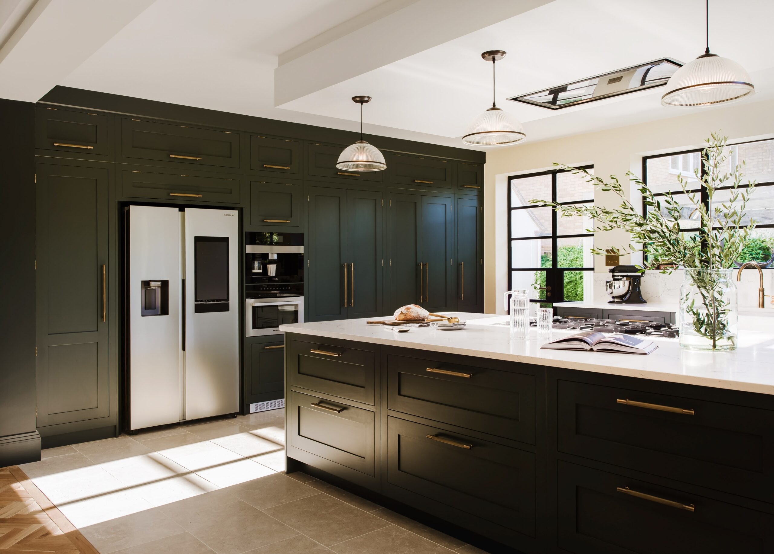
13. Forest Green
Cabinetry: Deep forest or hunter green
Worktops: White marble, honed black granite or pale quartz
Hardware: Aged brass, unlacquered bronze or matt black
Walls: Warm white or soft stone
Flooring: Dark oak or slate-effect stone
Best for: Country homes, traditional properties, confident design statements
14. Warm Greige
Cabinetry: Mid-warm grey, greige or mushroom
Worktops: Warm white quartz, honed limestone or pale oak
Hardware: Brushed nickel, satin chrome or aged brass
Walls: Soft warm white or pale blush
Flooring: Wide plank oak, stone or warm-toned porcelain
Best for: Modern family kitchens, open plan spaces, versatile year-round appeal
15. Soft Blue and Off-White
Cabinetry: Powder blue, duck egg or dusty cornflower
Worktops: Pale quartz, white marble or warm oak
Hardware: Brushed chrome, satin nickel or aged brass
Walls: Soft white or very pale grey
Flooring: Pale stone, whitened oak or light encaustic tile
Best for: Coastal or country homes, rooms with good natural light, relaxed family kitchens
Colours That Make a Kitchen Look Expensive
Certain kitchen colour schemes naturally feel more luxurious through the balance of colour, finish and material. Deep matt shades like navy, forest green and burgundy create a richer look than high gloss finishes, while warm whites paired with aged brass and natural stone offer a timeless high-end combination.
Natural wood also adds warmth and depth, especially in two-tone kitchens that mix painted cabinetry with visible wood grain. This layered approach therefore gives the space a more bespoke and considered feel.
Find Your Perfect Kitchen Colour Scheme
The right kitchen colour scheme shapes how the space feels every day, how well it works alongside the rest of your home and how much you will love it for years to come.
Whether you are drawn to the quiet confidence of a neutral palette, the timeless appeal of a two-tone shaker kitchen or the bold personality of a deep jewel tone, the key is choosing something that genuinely reflects how you live. The most beautiful kitchens are the ones designed for you specifically.
Frequently Asked Questions
What are popular kitchen colour schemes for a modern British home?
The most popular kitchen colour scheme ideas in British homes right now include warm whites and off-whites with natural wood accents, soft greys with brass hardware, sage and forest greens, and two-tone combinations. Deep navy and warm greige are also consistently requested in bespoke kitchen design.
Should your kitchen cabinets be lighter or darker than your walls?
There is no fixed rule, but in most kitchens, keeping cabinetry slightly darker than walls creates a grounded, anchored feel. Very pale cabinetry against white walls can look washed out unless contrasting elements, worktops, flooring or hardware, therefore add definition. If you are working with dark cabinetry, slightly lighter walls help prevent the kitchen from feeling heavy, while also creating a greater sense of balance and contrast.
What are the top 5 kitchen colours?
Based on what we see consistently in luxury bespoke kitchens, the top five are: soft white, warm grey or greige, sage and muted green, deep navy blue, and natural wood tones used as a colour in their own right alongside painted cabinetry.
What colours make a home look expensive?
In kitchen design, tones that consistently feel high-end include warm white with brass hardware, deep matt navy, forest green with aged bronze fittings, soft greige with honed stone worktops, and natural wood finishes. The finish matters as much as the colour, therefore matt and eggshell almost always read as more luxurious than high gloss.
What are the best kitchen colour schemes to pair with modern appliances?
Stainless steel and brushed stainless appliances work with almost any colour scheme, therefore making them the most flexible choice in a high end kitchen design. For integrated appliances, the cabinetry colour takes centre stage, so a bold shade becomes even more impactful. If you have statement appliance finishes, black stainless or coloured AGA ranges, build your palette around them rather than against them.
What are the best two-tone kitchen cabinet colour combinations?
The most reliable two-tone kitchen colour combination ideas include: cream uppers with sage green lowers, white uppers with navy blue lowers, greige uppers with a natural wood or charcoal island, and pale neutrals throughout with a contrasting painted larder or pantry unit as a focal point. The key is ensuring the two tones share a similar warmth or coolness so they feel intentional rather than mismatched.
Can I get help choosing a kitchen colour scheme at a Harvey Jones showroom?
Yes. Every Harvey Jones kitchen design appointment includes colour consultation as part of the process. Our designers will consider your home’s light, existing finishes, lifestyle and personal taste to help narrow down the kitchen colour scheme ideas that will work best for you.
Begin your design journey and craft your dream kitchen.